Film Riot

Color Grading Workspaces

We spent the first half of our Color 101 series covering the basics of human vision, cameras, and displays, which together form the key factors in any motion-imaging workflow. Having done this, we’re now ready to build on this foundation and begin exploring the core philosophies, tools, and techniques of color grading. We’re going to begin this exploration by discussing one of the most critical (and most overlooked) choices in any grade: working with our images in a scene-referred versus display-referred context. If you’re unclear about what this means, or its implications for your images, read on!

The Basics

To understand what we mean when we refer to scene-referred or display-referred workflows, let’s recap a few basics.

We learned earlier in this series that any imaging system — whether a camera, a display, or our own eyes — interprets light and color in its own way, and that we can measure and express these unique characteristics in terms of their gamma (or tone curve) and gamut. Collectively, this gamma/gamut pair defines a device’s color space. Once we know the color space of our source(s) as well as that of our display, we can make an accurate mathematical translation from one to the other.

So, in simplest terms:

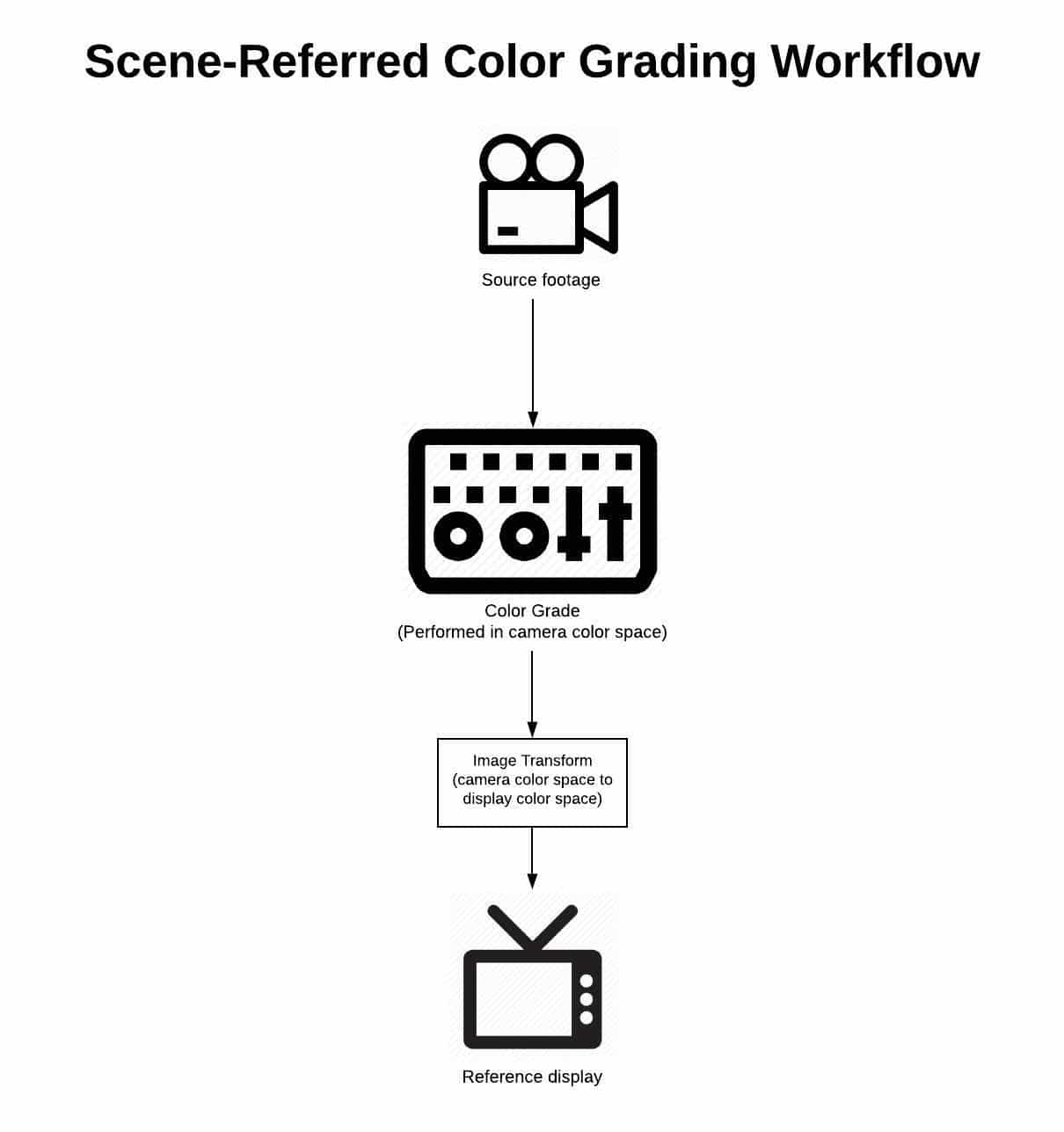
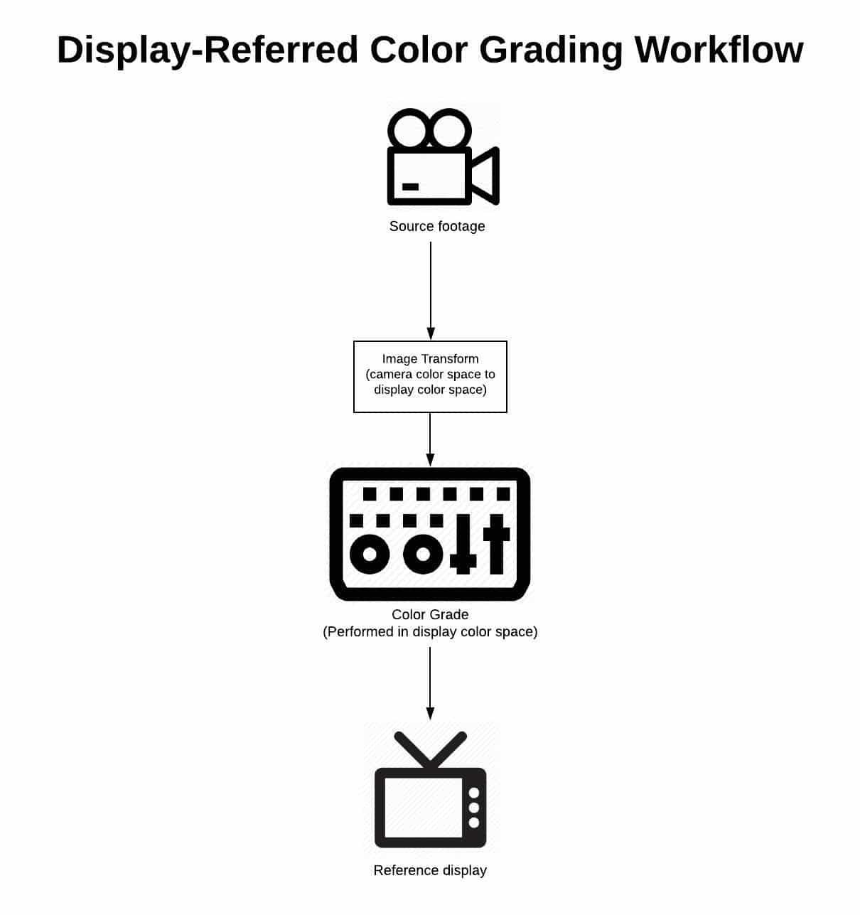
A scene-referred workflow is one in which we manipulate our images prior to their transformation from camera color space to display color space. A display-referred workflow is one in which we manipulate our images after they’ve been transformed from camera color space to display color space.

Scene Referred Workflow Diagram

Display Referred Workflow Diagram

Easy enough, right? But what impact do these different approaches have on our images? How can we know which is right for us? And how can we practically implement this knowledge in our workflows?

To answer these questions, we need some historical context.

A Bit of History

Modern color grading tools and techniques represent the union of two distinct forms of image mastering: color timing and color correction.

pasted image 0

Color timing is a craft nearly as old as filmmaking itself — until the last few decades, it was the sole method by which film images bound for theatrical release were mastered. It is a photochemical laboratory process which manipulates film images through the use of physical light, and it is inherently scene-referred in nature.

Color correction is a younger discipline, made possible with the advent of video imaging. It is an electronic process which manipulates images by altering their encoded signal. Color correction was designed to tweak broadcast images which were already in display color space, and as a result it is an inherently display-referred process.

The history of modern color grading can be understood as a slow merging of these two methodologies, with milestones including telecine (video capture and electronic manipulation of film negative), digital intermediate (digital manipulation of film negative before being printed back to film positive), and the rise of digital cinema cameras. Today, the fusion between color correction and color timing seems complete. Practitioners of both are given the same title (colorist), use the same software, and are expected to be capable of working with film as well as broadcast images. Even the terms themselves have been largely discarded in favor of the more-inclusive heading of color grading.

But the discrepancies between the techniques and philosophy of each discipline are still with us, and can have a huge impact on our work. The choice between working display-referred and scene-referred is a perfect example. In order to successfully navigate this choice, we need to understand the ramifications of each approach, and make a conscious decision in support of our creative vision. So let’s take a look at the pros and cons of each.

Pros and Cons

Display-referred workflows

As we’ve learned in this series, all images undergo a multi-part journey from sensor (or film negative) to screen. A display-referred workflow operates on its images at the very end of that journey — following the transform from camera color space to display color space.

There are several benefits to working in this way. First, it requires virtually no knowledge or implementation of color management — meaning accurate technical transformation between color spaces. It also allows for grading to begin as soon as shots are loaded into the colorist’s software, with virtually no prep or setup required. Finally, with everything being done by hand, it generally feels highly tactile and creative.

These benefits are alluring enough that many colorists and filmmakers never look past them, but they come at high cost, both to the process and the end result. For starters, once transformed into its display state, an image loses much of its dynamic range and color information, affording the artist less flexibility to make clean manipulations. Equally problematic, displays interpret light and color differently than our eyes do, so an image transformed into display color space responds to adjustments in a very non-intuitive way. For example, in display space, operations as simple as an exposure adjustment require the careful manipulation of several different controls in order to get a perceptually linear response. Finally, because they’re not supported by good color management, display-referred workflows place too much burden on our eyes and display — both of which can lie to us in a variety of ways.

Scene-referred workflows

In contrast to display-referred workflows, scene-referred workflows operate on their images in the state they were captured in, i.e. prior to their transformation from camera color space to display color space.

One of the key benefits of scene-referred workflows is the consistency they afford. Because we’re operating upstream of a global transform, images tend to flow from one to another more easily. Working scene-referred also allows for more intuitive adjustments, because we’re operating on the image in a color space similar to that of our vision system. Unlike in a display-referred environment, operations such as exposure and color temperature shifts can be made cleanly and simply with a single knob. Finally, scene-referred workflows give us full access to the dynamic range and color information captured in-camera — much of which is truncated by the time the image is transformed into its display state.

Sounds like the superior choice, right? But what about the cons of this workflow?

There are two key cons to this workflow, which are enough to deter far too many filmmakers from using it. The first is that it requires us to learn the basics of our image’s journey from sensor to screen. The second is that it requires us to lay a proper foundation in our grade before we begin turning knobs. Both of these take time, and neither are very sexy. But the truth is that we owe this diligence to ourselves, our collaborators, and our images. The good news is, you’re more than halfway there by taking the time to read through this series!

Let’s wrap up by looking at the fundamentals of building a scene-referred workflow for your next grade.

Building a Scene-referred Workflow

Building a scene-referred workflow is simpler than it seems: all you’ll need is an edit consisting of footage from a professional or prosumer camera captured in a log format, and a good color grading application such as Blackmagic Design’s Davinci Resolve.

Step 1: Ensure you’re working with footage straight from the camera

When we’re grading, we want access to any and all color information captured on set, so the first step in setting up your grading workflow should be to ensure your timeline contains camera-original media, rather than proxies, transcodes, or exports. These will generally contain less information than the original footage, and often will have LUTs or temp color “baked” in, all of which compromise your ability to master the strongest possible image.

While a discussion of your overall post-production workflow is beyond the scope of this article, I encourage you to test and work this out well in advance, including a plan for relinking to camera-original material if you decide to use a proxy or “offline” workflow.

Step 2: Decide on how you’ll map from camera color space to display color space

There are many ways to transform your images from their camera color space to display color space, including LUTs, and Resolve’s Color Space Transform tool, and manual adjustment. In the case of raw formats such as R3D and ARRIRAW, you can even choose to unpack (or debayer) your raw images directly into display space. Each of these carries its own benefits and caveats, but here are the key criteria for choosing and deploying a transform that will properly serve your scene-referred workflow:

  • We need to be able to control where in our image pipeline it’s deployed. This disqualifies doing our transform at the initial debayer stage, because once we’ve done so, we have no access to the camera-original scene data while grading.
  • The transform should be technically sound, meaning it’s set up to receive an image in a color space matching that of our camera (e.g. Arri LogC), and to accurately transform that image into the color space of our display (e.g. Rec 709).
  • The transform should be consistently applied at the same point in the imaging pipeline for all shots in your timeline.

Step 3: Do your grading prior to your transform from camera color space to display color space

Once you’ve set up your transform in step 2, all you have to do is ensure you do your grading prior to this point in the image pipeline, such that the transform is always the last operation to take place on your image. In Resolve, this simply means creating nodes to the left of this final output transform.

It’s worth noting that if you’re used to working in a display-referred context, your controls will react differently than what you’re used to. But with a bit of practice, you’ll soon find doing your grade in-camera color space to be simpler, more intuitive, and to produce better-looking images.

pasted image 0 1

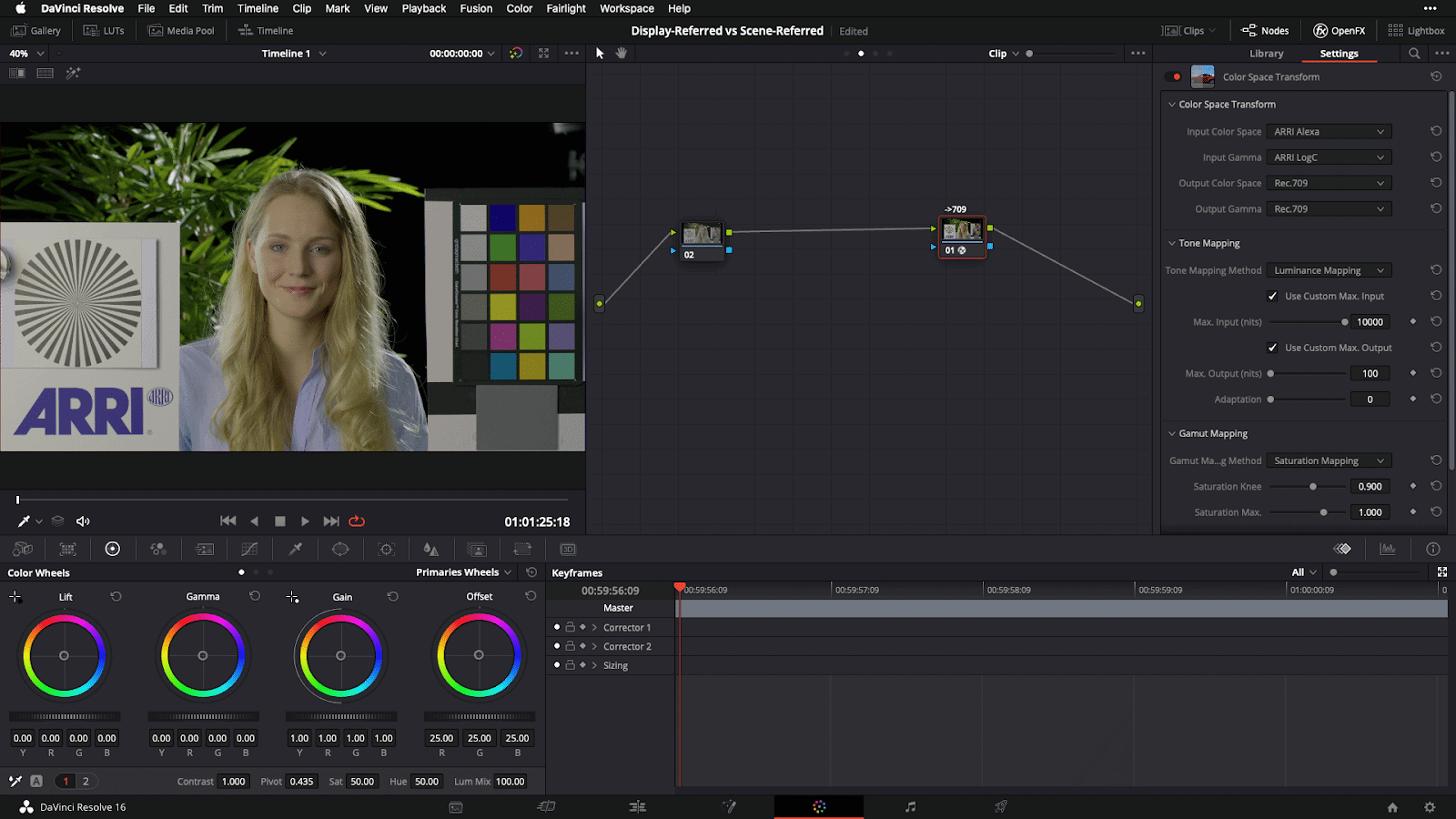
[Caption: Example scene-referred grading setup in Davinci Resolve, demonstrating a Color Space Transform from Arri LogC camera color space to Rec709 display space]

Closing

I hope it’s clear by now that the advantages of scene-referred workflows far outweigh the convenience of working display-referred. This advantage gets even larger when we consider the increasingly common need to strike deliverables for multiple displays. With a robust scene-referred workflow, we can simply target a different output for our grade, whereas in a display-referred workflow, we essentially have to start over, making subjective adjustments by hand to try and match our look between two or more displays. Educating ourselves on scene-referred workflows and taking the time to set them up is a small investment that pays dividends every time.

Now that we understand the implications of working scene-referred versus display-referred, as well as how to set up a proper workflow for the former, we’re ready to get hands-on with what I call the “Desert Island” tools of color grading — the five basic tools you can accomplish nearly anything with once you understand them. We’ll be covering this in our next installment of this series — see you then!

Sound Design Lessons from T2 and Star Wars

Sound Design in a Moment

When people hear the phrase “sound design,” they tend to think Star Wars.

Light saber hits, laser blasters, spaceship explosions.

These momentary onscreen sounds are known as hard effects. In most films, you’ll more often hear unassuming hard effects like a door closing or a car pass-by. They’re typically things on screen making a sound for a short period of time.

That doesn’t mean hard effects can’t have depth. When sound design is executed perfectly, it’s much more than just ear candy; it’s a narrative device with infinite potential.

Let’s deconstruct a shotgun blast from Terminator 2: Judgment day.

That sound could have just been a shotgun going off in a hallway, but there’s a lot going on in that blast. And it’s not there just so it can sound massively cool—it’s all there for a reason.

Arnie shoots that same gun 6 more times afterward, but it’s not the same as that first massive blast. The subsequent shots are more bare. They don’t have the canyon echo and the other accoutrements. That’s because that first shotgun blast needed narrative weight.

We, as the audience, have some revelations when that shotgun is first fired:

  1. We see the first literal collision of Terminators searching for John Connor
  2. Arnie wasn’t trying to kill John
  3. That cop we had a weird feeling about is probably a bad guy
  4. That bad guy cop is probably made out of liquid metal

For all those reasons, that first shotgun blast was important. That first shotgun blast needed its close-up in sharp focus. The thoughtful, layered sound design smacked a huge exclamation point on that turning point in the story.

You can’t just tack on this kind of impactful sound design in post-production as an afterthought.

In most cases, it’s the writing, staging, and editing of the scene which allow for that kind of layered, meaningful sound design to happen.  It’s important to know that most great sound moments are actually born from the writing and directing. It’s a whole other topic I should cover at a later time.

From the Ordinary to the Hyper-real

Sound designer and re-recording mixer Gary Rydstrom mentions in the video’s commentary that in the early 90s, James Cameron communicated to him the concept of hyper-real—bigger than life sound. It’s crazy to think that was a novel concept 30 years ago. Now we’re neck-deep in Transformers and Marvel type films where there’s no shortage of aural hyper-reality.

But you can have a damn good time with everyday sounds, too.

The sound design in Mad Max Fury Road is amazing.

A couple of years ago I interviewed sound designer Mark Mangini. He won an Oscar in 2015 for supervising the sound on Mad Max: Fury Road. His resume is incredible. You might think I jumped to ask him about the flamethrowing guitar or Furiosa’s war rig, but I was more excited to talk to him about doors.

A door is a ubiquitous object, but it’s also one of the more diverse and complex mechanical devices we interact with every single day. Because of those mechanics, we can use doors as an opportunity to express ideas and emotion.

Mark is a passionate guy and it’s fun to hear him philosophize about sound. I knew mentioning doors to him would get him excited and elicit a great response.

I basically just said to him, “Alright, Mark. Doors… Go!”

What followed is this 2-minute gem.

Sound Design of a Scene

Before you started reading this, it may have already been obvious to you that sound design could be a light saber or a T-Rex roar. But if you think about sound design as having an arc over the duration of a film, we’re now getting into the scope of what sound design actually is.

Sound design is everything you hear.

That’s actually the first definition of sound design, says Walter Murch, the first-ever credited sound designer ever (for Coppola’s Apocalypse Now). In his words:

“Just like a production designer arranges things in the 3-D space of the set, and makes it interesting to look at, I’m essentially doing the same thing with the 3-D [aural] space of the theater. Where am I going to use it in full, and where am I not going to use it? Where are we going to hold back, and where do we expand and contract?”

Only later did it start meaning the creation of sounds that we’ve never heard before.

Here’s an exciting hand to hand combat scene from Terminator 2 chock full of badass, yet thoughtful sounds.

In that scene, you obviously heard a lot of great hard effects; but let’s think about how sound develops over the course of the scene.

The first thing to notice is how quietly it all starts.

The sounds of the Terminator’s footsteps/leather/zippers/buckles help to inform the audience how quiet it is. The suspense builds until the T-1000 lunges from out of nowhere and triggers a tense melee. T2 as a film uses the juxtaposition of LOUD quiet LOUD often, and it’s an example of one of our most powerful cinematic tools.

Contrast.

You can’t have an effective loud moment without a quiet moment. The most powerful chorus of a song comes after the stark, quiet verse. The most terrifying sound in the world can be made to be even more spine chilling if there was pleasant, soothing wind before it.

Another sound detail is what isn’t in the scene. There’s zero dialogue. But wait. Not only is there no dialogue but there aren’t even the sound of “efforts.” Efforts are vocalizations of exertion or pain—the “UNH!” when someone throws a punch, or a “HNNG!” when lifting a heavy object.

What we don’t hear in the scene is also important, and tells us things about the characters and the story.

You see, the company that created the terminators, Cyberdyne, got some things wrong when programming these machines. When they exert themselves, they don’t vocalize. They don’t scream out in pain. They don’t pant in exhaustion. (Do terminators even breathe?)

s F50C4DF2C950F21B1CBCF1781031D25345515DB966990271E39D90BCBC4B8F27 1598082451463 m8dtetw ec001 h 2000

It’s one of the things that makes the terminators seem oddly unhuman. Cyberdyne’s bug is actually a feature of T2’s soundtrack. The terminators’ disturbing silence is one way they reveal their lack of humanity.

Even the ambience track is reacting to the action you’re seeing. Everything surrounding the scene is made to be alive, giving you information and moving the scene forward for you to react to the story.

As things get weirder and more intense in the scene, so does the environment. Those environmental sounds are also foreshadowing the mechanical clunking of the gears that the T-800 ultimately gets trapped in. It’s a smooth and invisible transition, much like music in a film, the audience shouldn’t notice when it’s entering or exiting a scene. We want it to gently manipulate our emotions without our detecting the seams.

Walter Murch said it best:

“The visual material knocks on the front door … Sound tends to come in the back door, or sometimes even sneak in through the windows or through the floorboards.”

There is Sound Design in Music

Speaking of music, the Terminator 2 score is notable. It utilizes lots of metal and mechanical sounds that fit perfectly in with the themes of the film. You can’t underestimate the sound design aspect of your score to also support the content and themes of your story. The composer of T2’s score, Brad Fiedel, has some interesting words about how he walked the line between music and sound design.

“One director I’d worked with in the past came out of the Hollywood premiere screening of [T2] saying, ‘This is definitely starting a new era off.’ He was referring to the kind of seamless relationship between music and sound effects, because he couldn’t tell the difference between what I had done and what they had done, and in some cases, there were things I did that were very much sound effects in a sense, though I didn’t intend them to be.” – Brad Fiedel, Composer, Terminator 2: Judgment Day

For a fantastic deep dive into T2’s score (and one of the best Arnie impressions out there) check out Alex Ball’s amazing video.

By the way, Brad Fiedel’s director friend was right. We’re in an era now where music is being completely embraced as another opportunity for sound design. Bombastic, melodic orchestral cues are often replaced with textural mood pieces. Terminator 2 was one of the first blockbusters to really pull it off in the mainstream.

Sound Design Can be an Entire Film

You may be familiar with this image that made the internet rounds a few years back.

The color pattern of the James Bond film Skyfall (2012) revealed


The image contains a frame of every shot in the James Bond film Skyfall. When you see those frames together in a single image, a hidden pattern in the film’s cinematography and color grade reveals itself. By seeing the film in this way we see a clear, deliberate visual arc that is expressed over the entire 144-minute film.

Although less obvious, sound design can communicate with a similar aural arc.

s F50C4DF2C950F21B1CBCF1781031D25345515DB966990271E39D90BCBC4B8F27 1595851617912 2020 07 2614 04 47 ProTools
Here’s a visual representation of the 5.1 Surround Sound stems of Skyfall.


s F50C4DF2C950F21B1CBCF1781031D25345515DB966990271E39D90BCBC4B8F27 1595851624251 2020 07 2615 20 30 ProTools
Hmm, does this help? Nevermind.


OK, so, waveforms don’t really give us the best example of this.

A better example is from the film The Matrix. The film’s sound designer Dane Davis talks about how the sound design of the fight scenes (whooshes, punches, kicks, impacts) over the course of the film create its own arc. In his words:

“We wanted to have a developmental arc from the first fight to the last fight so that we didn’t use up our whole arsenal [of sound effects] right off the top with this first training fight. We kept it deliberately very restrained and pretty naturalistic, comparatively speaking, so that in the final sequence between Smith and Neo in the subway station we could pull out all the stops and make that extremely physical and huge and explosive and painful on every level.“ ~ -Dane Davis, Sound Designer, The Matrix

s F50C4DF2C950F21B1CBCF1781031D25345515DB966990271E39D90BCBC4B8F27 1595858650361 2020 07 2706 58 37 The.Matrix.1999.1080p.BluRay.x265.10bit z97.mkv VLCmediaplayer
Restrained, naturalistic.


s F50C4DF2C950F21B1CBCF1781031D25345515DB966990271E39D90BCBC4B8F27 1595858629137 2020 07 2707 02 38 The.Matrix.1999.1080p.BluRay.x265.10bit z97.mkv VLCmediaplayer
Huge, explosive, painful on every level.


See this Instagram post by INDEPTH Sound Design to dive deeper into the sound of The Matrix:

https://www.instagram.com/p/CAX_oaFp-TC/

All of the above examples are, of course, massive Hollywood blockbusters. These are the types of films that come to mind when people think of sound design. In fact, every film I’ve mentioned in this post won an Oscar for either Best Sound Mixing or Best Sound Editing.

But only using this type of sound design in massive films doesn’t have to be the case. It shouldn’t be the case. The concepts I’ve mentioned work for all films and, really, they’re the very essence of cinema.

Sound Design Can be Expansive

In the original Star Wars trilogy, there’s a substantial sound design arc that takes place over the course of all three films, although you might not notice it.

In Episode IV, Ben Burtt and George Lucas noticed that the sound of light saber fights had a musical quality. For those scenes, they decided to forgo music altogether. They enjoyed the musicality and the raw credibility the sound of the light sabers projected.  Consequently, John Williams was able to take a much-deserved break for those scenes.

But as the trilogy builds, and the connections between Luke and Vader grow, more and more music finds its way into those scenes. The music builds on top of that strong foundation of the light saber sounds to culminate in Luke making amends with his father. So don’t let sound design limit you to the scope of a moment, a scene, or even an entire film.

s F50C4DF2C950F21B1CBCF1781031D25345515DB966990271E39D90BCBC4B8F27 1598083553707 EPIV Lightsabers1

The same thing happened in The Matrix trilogy. No one knew there would be two more sequels, so sound designer Dane Davis would have to extend the developmental arc of the fight scenes even further. Dane says:

“As it turns out, because of the two sequels [to The Matrix], we had to, in fact, extend that arc another five hours to the end of “Matrix Revolutions,” at which point we were cutting in cannon blasts and you name it to make those hits between Smith and Neo in the air even more powerful than anything else you’d heard in the previous two movies.”

s F50C4DF2C950F21B1CBCF1781031D25345515DB966990271E39D90BCBC4B8F27 1598081925601 cannonpunch

Try it Yourself

Maybe your comedy short isn’t full of bigger-than-life violence or sci-fi vehicles, but some moments, even entire scenes, might beg you to take the sound design to a tasteful place of hyper-reality to extract those extra laughs. Your dramatic romance film might necessitate a horror-esque wind howl to tell the audience something or create aural interest and style. After that, challenge yourself to take your cinematic sound beyond just the moments.

If Mark Mangini can get excited about doors, any kind of film can utilize exciting sound design.

To be cinematic is to be bold with sound. Go the extra mile!

Support Mike and INDEPTH Sound Design on Patreon