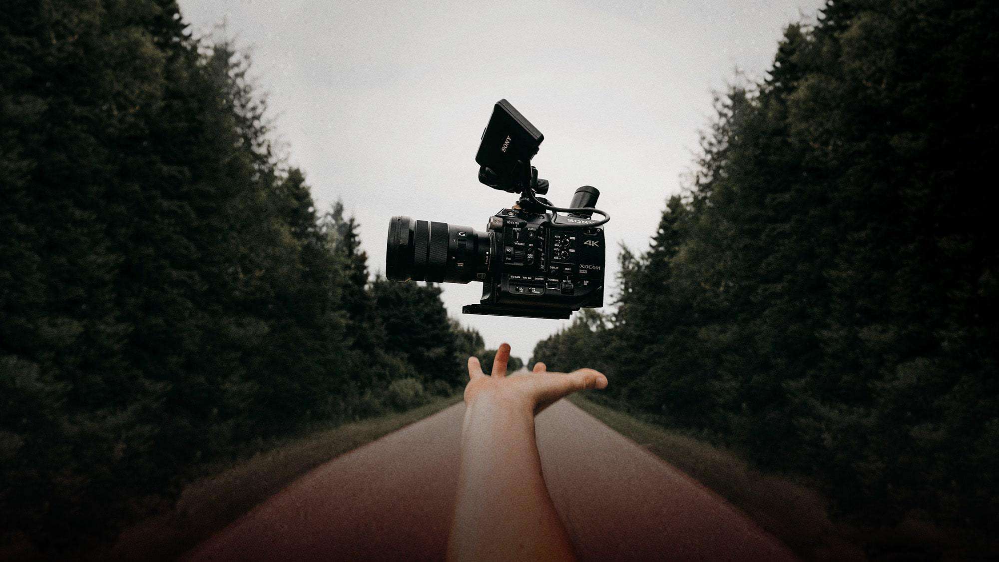
For over a decade, Film Riot has been dedicated to helping aspiring filmmakers learn about all the tips and tricks that make Hollywood movies “tick.” But as every good filmmaker knows, understanding the foundational basics is paramount if you want to be successful at telling stories with the moving image. That includes understanding shot types in filmmaking.
The next few episodes of Film Riot will cover some of those basics. First up is: Shot Types.
The 5 Shot Types in Filmmaking
In this series, Ryan uses the metaphor of writing a sentence to describe filmmaking. Shots are the words, coverage would be the collection of words to form that sentence, and editing is the arrangement of those words to form your sentence. In this episode, Ryan covers five shot types:
Shot Size
Angle
Framing
Movement
Focal Length
Shot Size
The shot types Ryan covers are not entirely exhaustive, but they cover the basics.
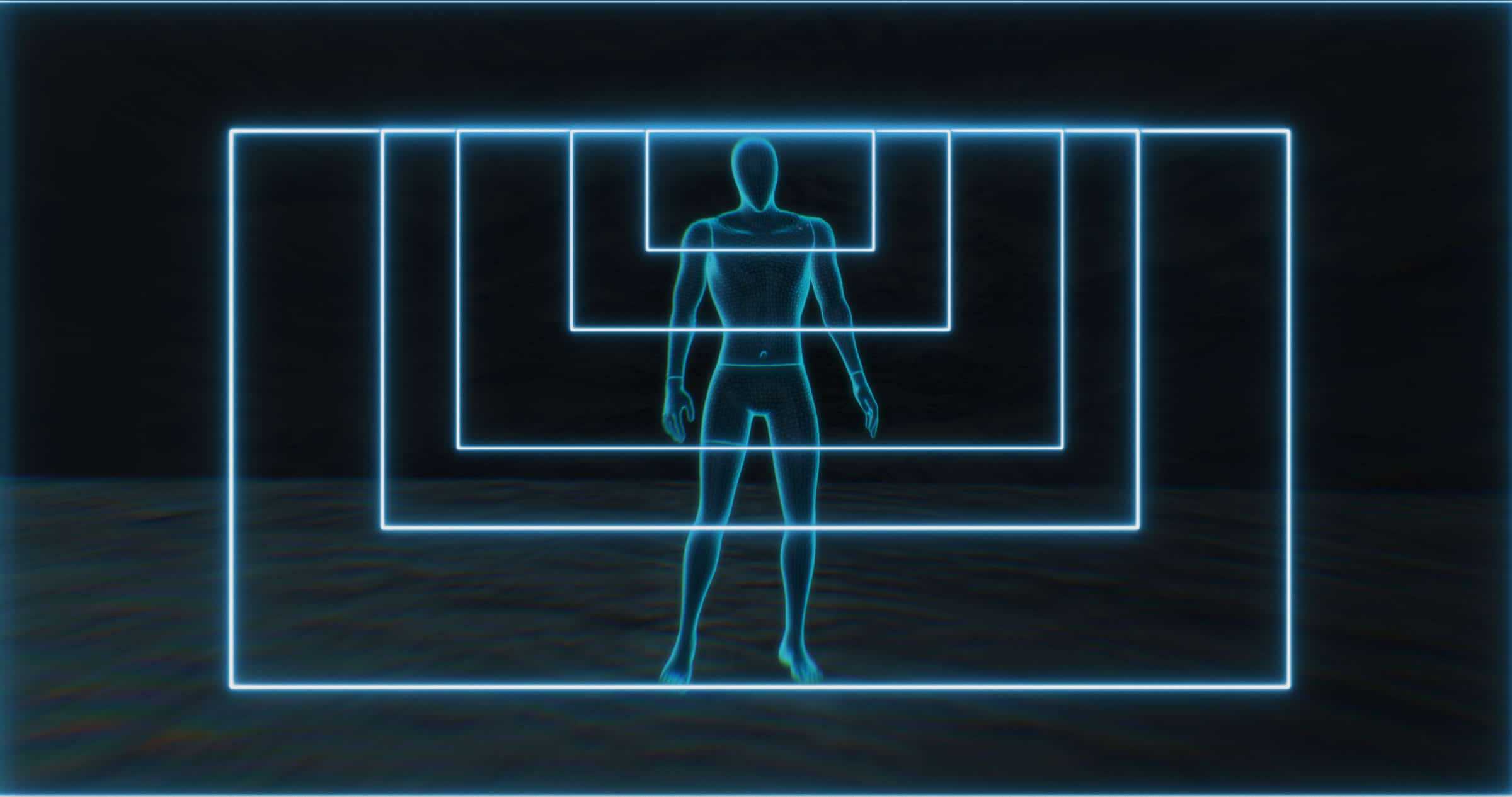
Extreme Wide Shot (EWS): a shot far from the subject that takes in the entirety of the area. Think of shots like a spaceship arriving to a planet; or the entirety of a castle and the large army arriving to sack it.
Wide Shot (WS): the subject is now in focus but they’re not filling the frame..
Full Shot (FS): a wide shot where your subject fills the frame, head to toe.
Medium Wide Shot (MWS): a “full shot” that is a bit closer such that the subject’s head and/or feet are cut off.
The “Cowboy Shot”: this is a version of the MWS that is called “the Cowboy” because the shot is cut off right where the person’s gun and holster would be.
Medium Shot (MS): the subject is framed from the hips up.
Medium Close-up (MCU): the framing is chest up. At this distance we can see the eyes more clearly, making the shot a lot more intimate. Many dialog scenes are shot with MCUs.
Close-up (CU): the subject fills the frame top to bottom. It is used sparingly and is often on people’s faces, but it doesn’t have to be. It can be that of a hand or prop.
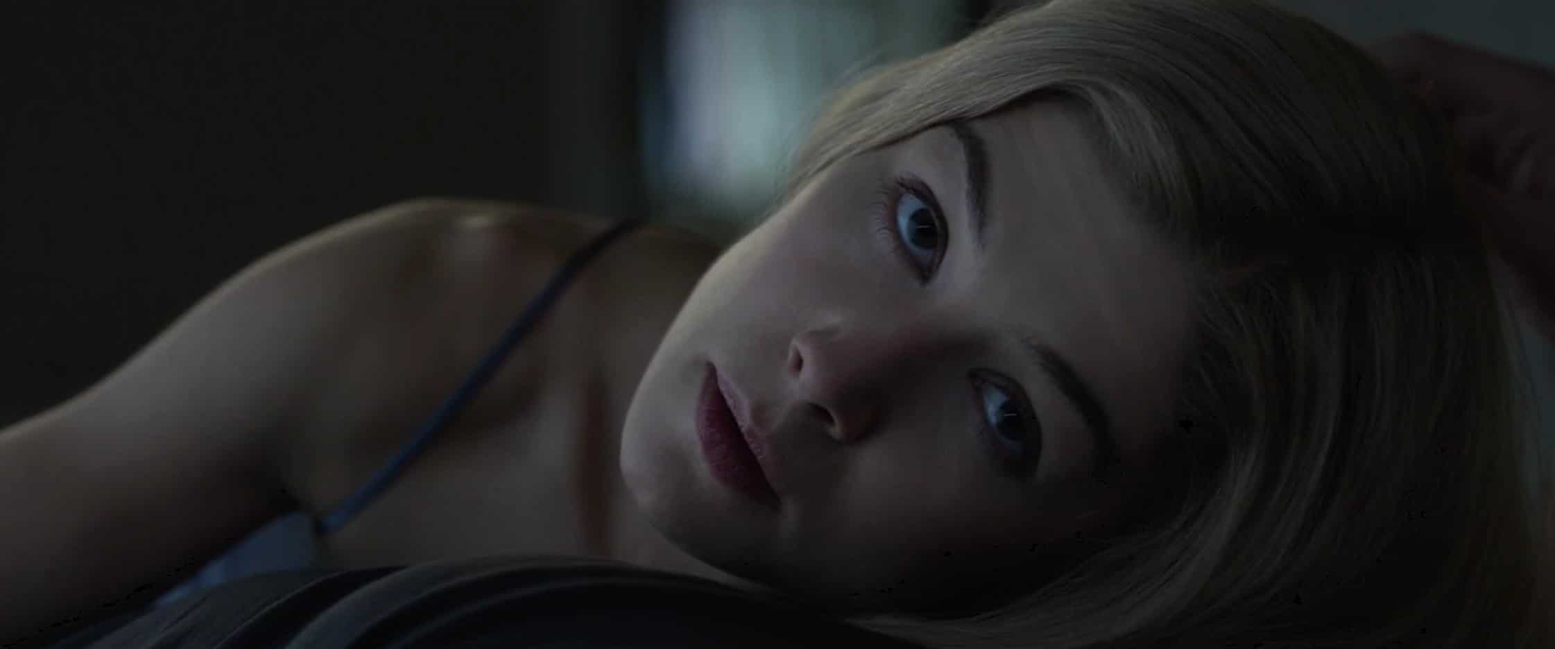
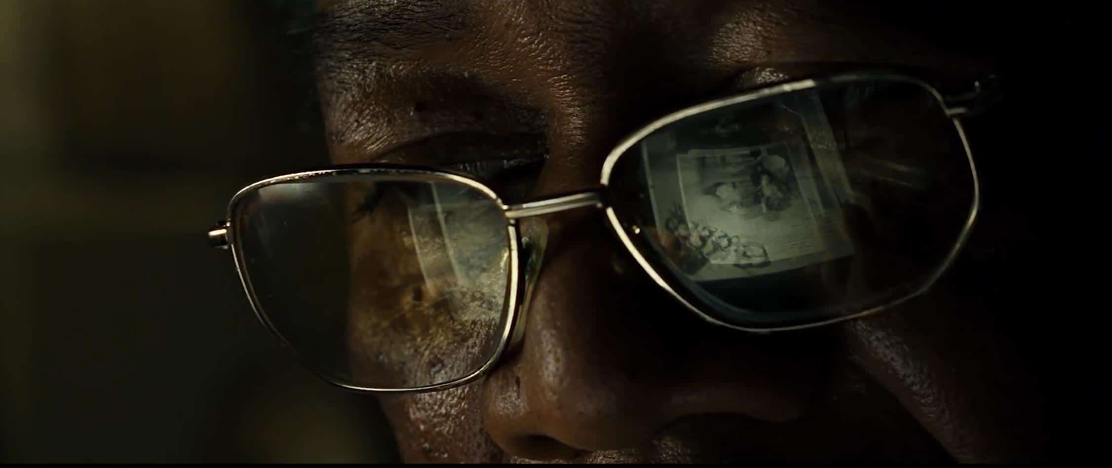
Extreme Close-up (ECU): an even closer (tighter) shot, often of a subject’s eyes or mouth. One of Ryan’s faves is this shot from “Se7en” where you can see Morgan Freeman’s eyes, as well as the reflection of the paper in his glasses.
Angle
This is the position of your camera relative to the subject in question.
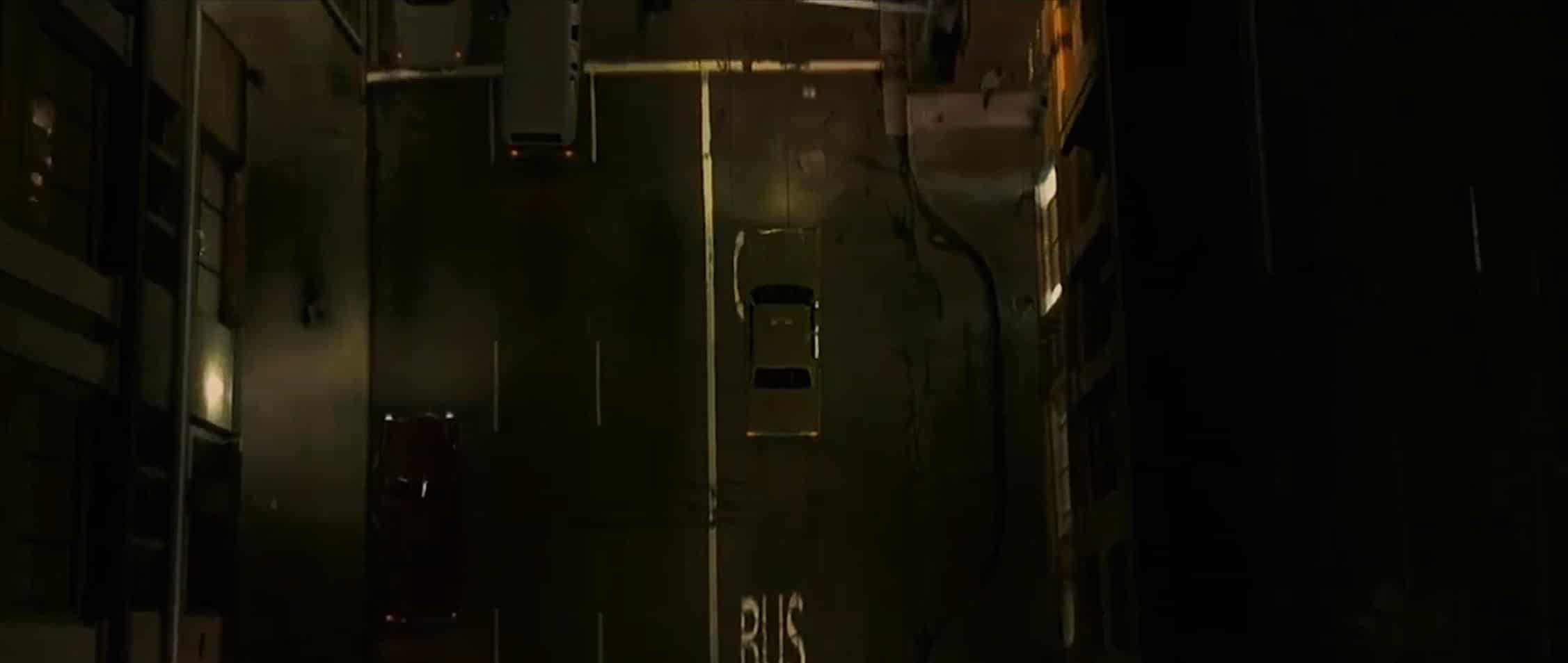
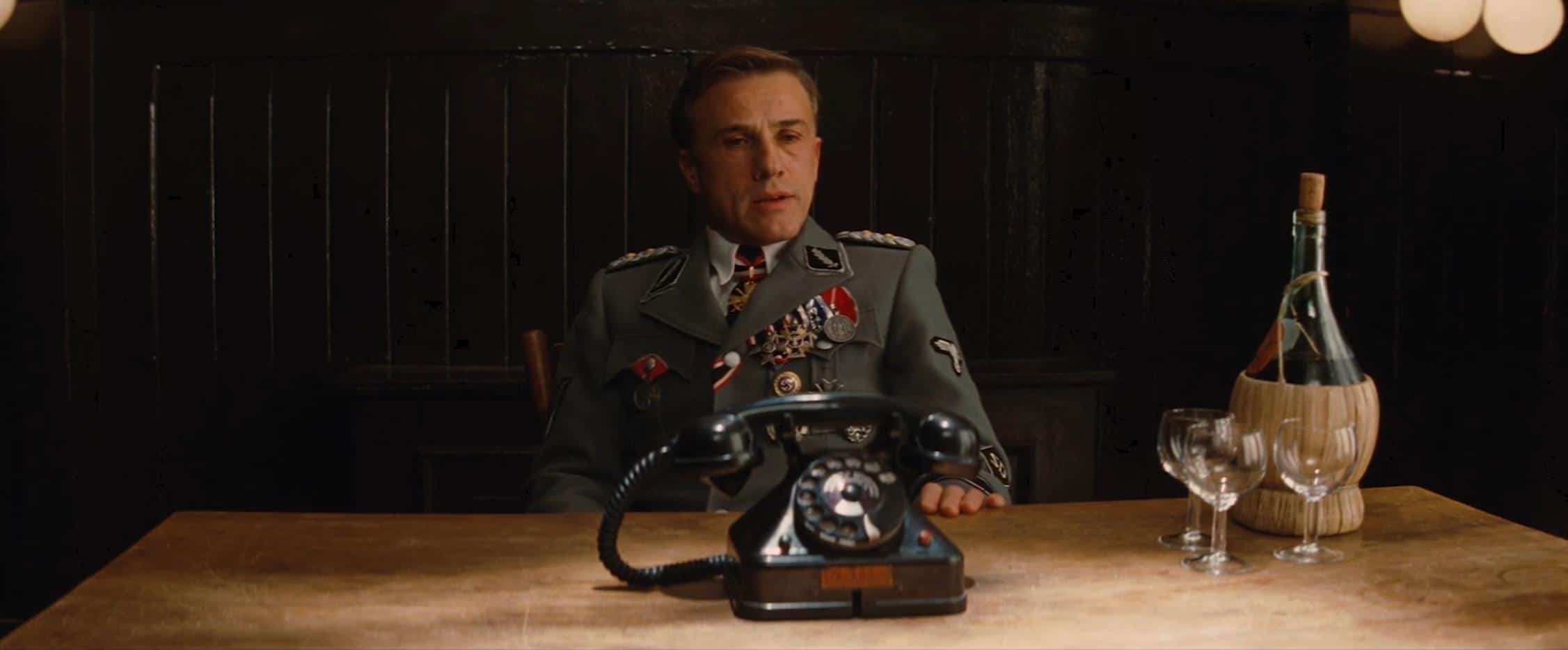
Bird’s Eye View. Usually done as some form of wide shot, this is where the camera is directly over the subject. The shot below from David Fincher’s “Zodiac” is one of Ryan’s favorites.
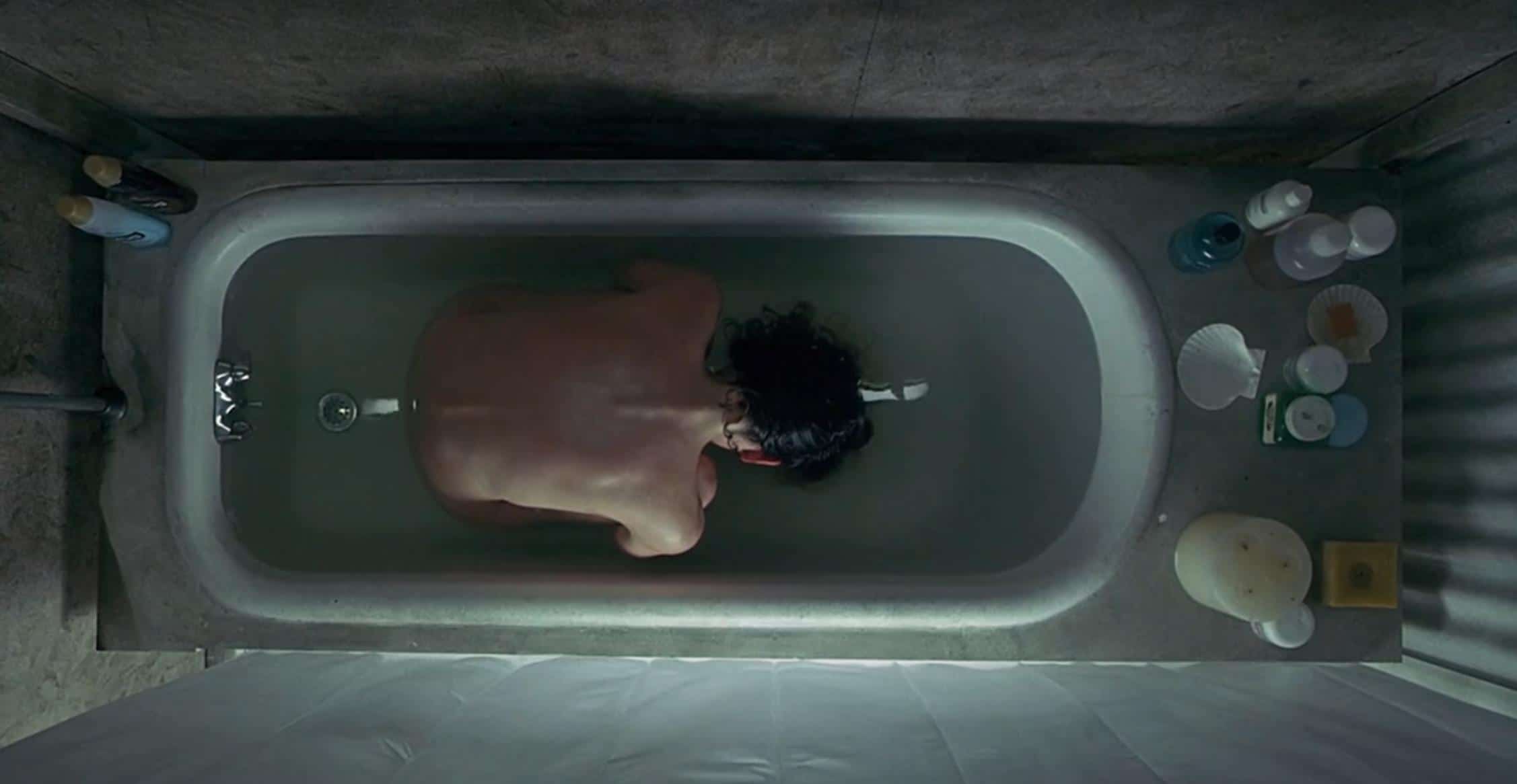
Overhead. The camera is directly above the subject (essentially a tighter version of the Bird’s Eye View).
High angle. Just above eye level, but not directly above the subject. Usually used thematically to make the subject seem lesser or weaker.
Low angle. Often used to make the subject seem dominant and powerful.
Dutch angle. Shots where the camera is off-center and titled. Ryan loves how the director Brian De Palma.
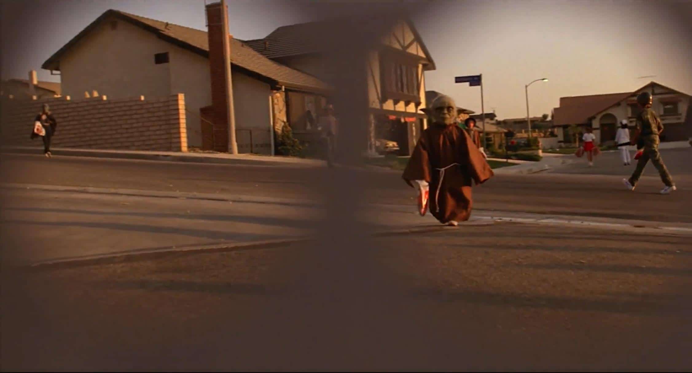
Point of View (POV). There are two versions of this angle: the implied and the literal. The implied POV is when a character looks in a direction, then you show what they’re looking at.
The literal POV is when the camera is in place of the subject and you are literally seeing what they’re seeing. It’s often used in horror films. Another good example is ET peering through his costume as he walks down the street with the kids.
Framing
Everything that goes into how you compose a shot.
Clean or Dirty. Clean framing is when there’s nothing between the camera and the subject. Dirty is when there are people and/or objects between you and some key subject in the frame.
Over the Shoulder (OTS). Framing the camera so that you’re looking over the shoulder of one character to another.
Single and Two-shots. A “single” is when you just have one character in frame, and a two-shot is when you have (you guessed it) two characters in frame.
Movement
These are just the basic movement shots. Be sure to check out this episode if you want a full run-down.
The Pan. The camera angle is changing, but the camera itself is not moving laterally.
The Tilt. Moving the camera on a vertical access from up to down or vice versa.
The Dolly. When the camera is placed on a dolly and moves towards or away from the subject, or laterally.
Zoom. The subject becomes closer or farther away by changing the focal length. The background stays static.
Tracking. This is where the camera tracks along with the subject, used during “walk and talk” scenes. The movie “1917” is essentially one long “tracking” shot.
Crane or Boom shot. Movement of the camera when placed on a crane or boom arm.
Focal Length
Focal length refers to the lens. Lenses can have wide, medium, or long focal lengths. You can mix and match focal lengths with shot sizes to create different feels. This is more subjective and will change, depending on what you want your audience to feel.
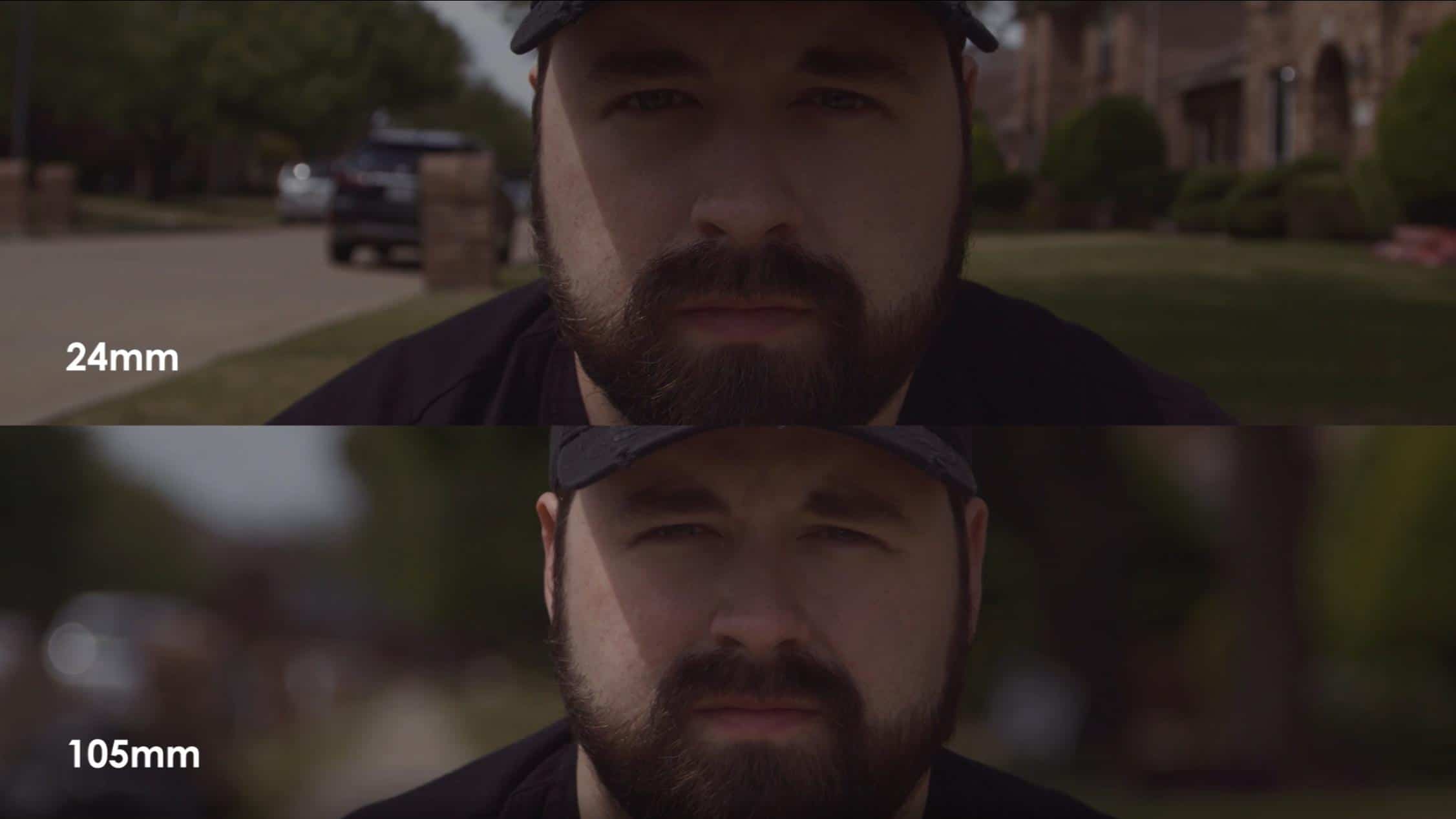
For instance, a close-up of a subject’s face on a long focal length (i.e. you’re zoomed in) will feel very different than a close-up using a wide-angle lens.
Close Up – long focal length (zoomed in)CU with a wide-angle lens.
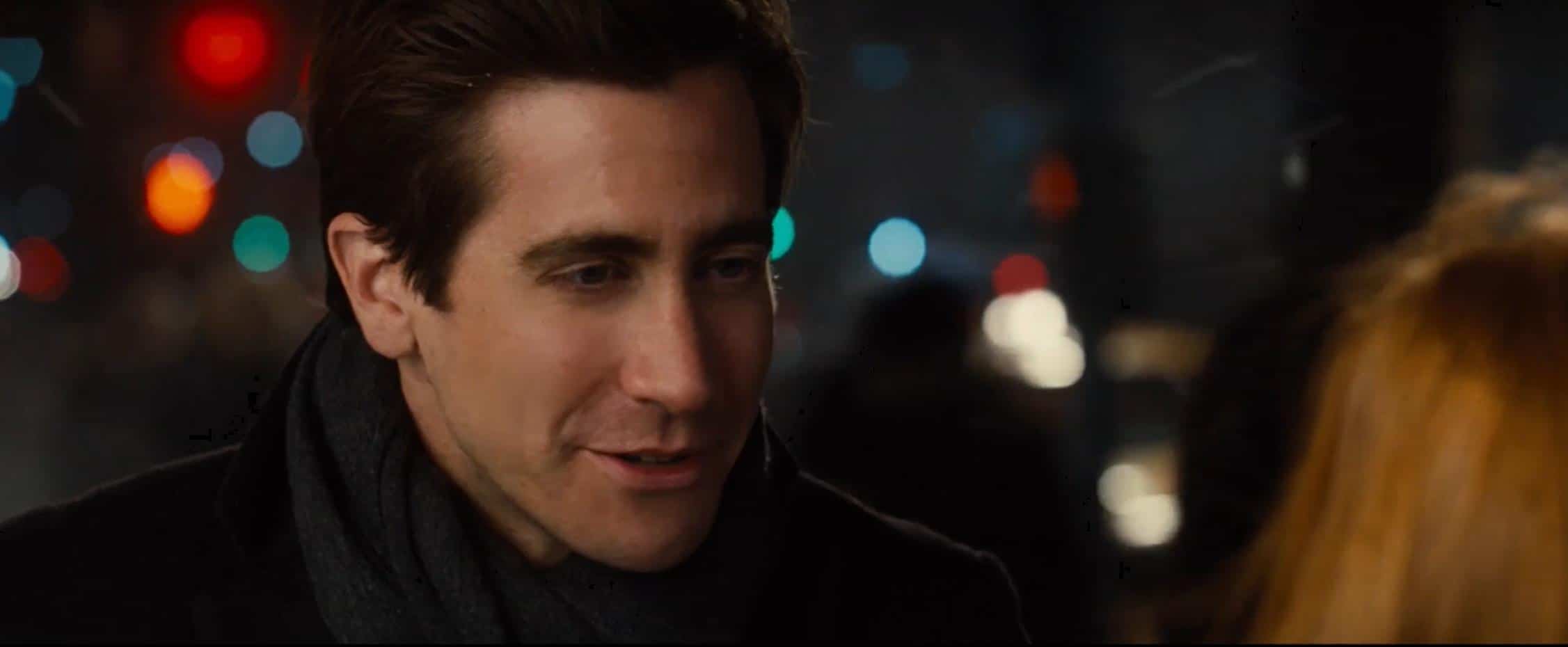
The background is also greatly affected when you have a close-up on a wide vs long. Like this shot of Josh below. The close-up on the long throws everything completely out of focus. Whereas the CU with the wide-angle lens keeps more of the background more from completely blurring out.
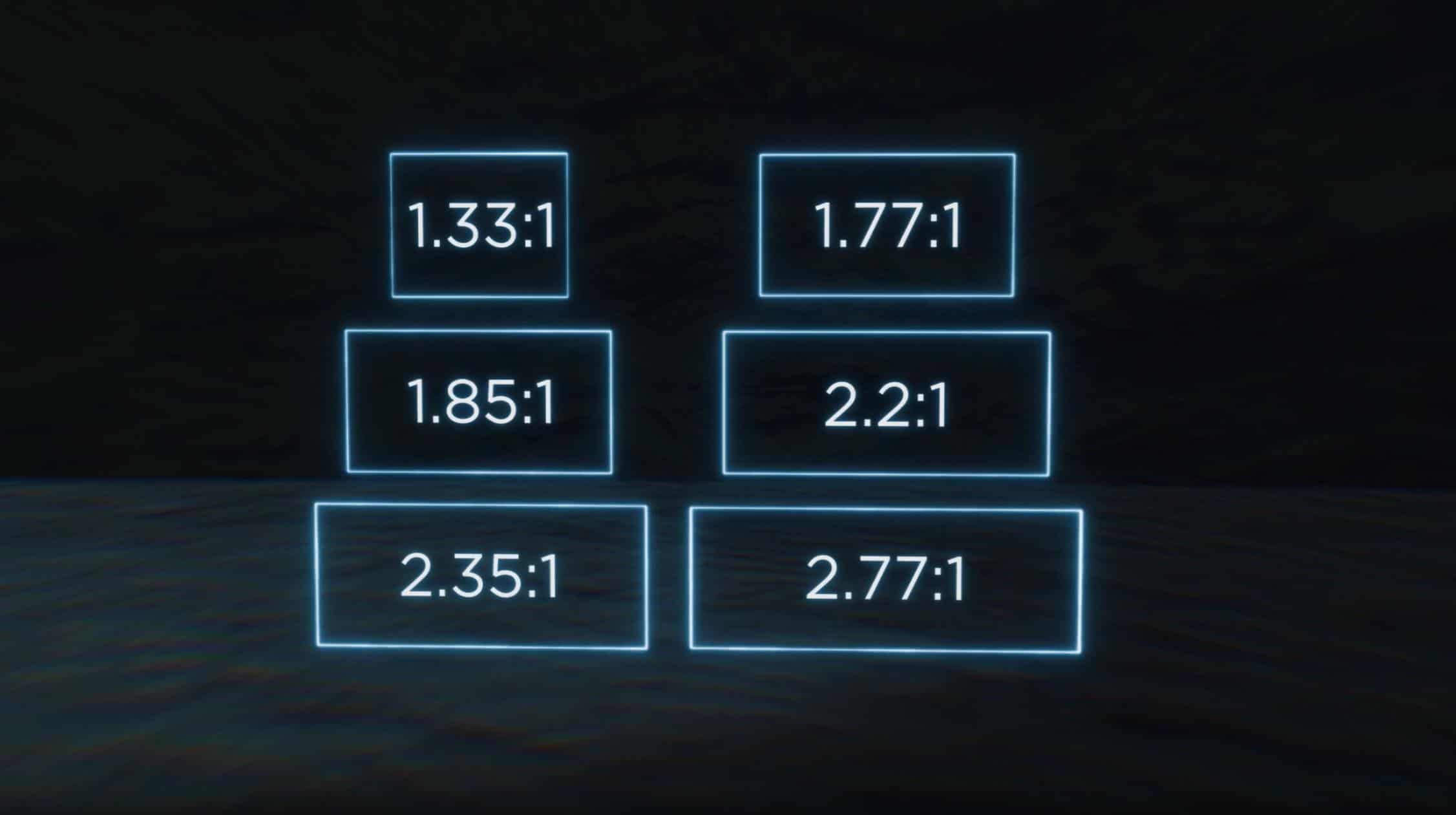
Aspect Ratio
It’s worth pointing out that the aspect ratio you choose for your film will affect which types of shots you use and how they are rendered on screen.
So there you have it. The basic “words” you need to construct your “sentence.” In case you missed it, here’s the episode that breaks down all of these shots.
“A focus puller, or 1st assistant camera, is a member of a film crew’s camera department, whose primary responsibility is to maintain image sharpness on whatever subject or action is being filmed.”
When the camera is rolling, the job of the 1st AC is to pull focus. Granted, it’s a bizarre and magical skill to keep an entire movie in focus, but being a good 1st AC is about a lot more than just keeping sharp focus. There is a lot more time on set spent waiting to roll versus actually rolling. The time in between takes is where leadership, or the lack of, is on full display.
A turning point in my camera assistant learning curve was seeing the crucial way a 1st AC would lead the camera department, for better or for worse. I’ve worked with a handful of focus pullers that can in fact, pull focus, but are total nightmares to work with, which in my experience, isn’t always the best trade-off.
What separates the average camera assistant from next-level, is whether or not they have the DP and the entire department’s needs in mind, or just their own needs. A camera department is only great when they’re a great team.
I find that sharing knowledge is vital in preparing aspiring filmmakers. Therefore, I asked a few professional camera assistants to dig deeper into a few skills and qualities that a solid 1st AC should have. Here’s what they had to say.
Diego Montiel
Diego Montiel is known for his work on Unhinged, Into the ashes, and I Can Only Imagine. You can follow him on IG here.
Photo by Justin Robinson
Take Care of Your People
Know how to deliver the bad news just like the good news. Know when to take one for your team and know when to let your team take it. Balance is key. “Complaints go up, not down.”
Don’t Treat Your Crew Like Kids
You’re not sh*t because you have people “under” you, technically speaking. Talk to them straightforwardly and sincerely, never judging, and always listening. Integrity will make people respect themselves and make them honor themselves more. And that creates encouragement to do better. If you joke on set, prepare to get joked on. If you don’t like jokes on you, then don’t joke with people.
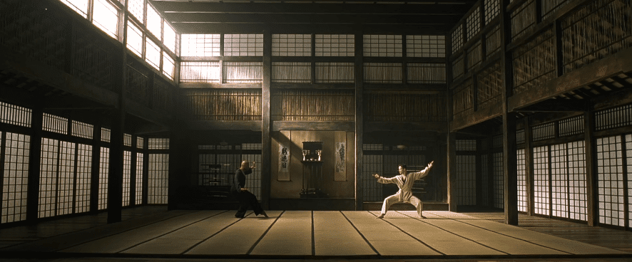
Be Physically and Mentally Capable
If you party hard, work harder. Don’t wait for the next project to get healthy or in shape. In THE LAST SAMURAI, Tom Cruise’s character got hit many times with a wooden sword before the Samurai accepted him; but it was his mental and physical abilities that made the change. I’m so demanding and so are other 1st ACs, so once I see you’re capable, that’s when I’ll teach you my ways.
Your Marks and Your Monitor
Know when to look at your monitor and when to stay away. Look at it a lot if you only mimicked rehearsals. Everybody f*cks up, but let it be known if you need marks or if you need to see the ending frame. Don’t have the DP babysit you. Sometimes, you have to live by your marks (e.g. if the action is too fast and too important to double-check yourself on the monitor). Sometimes, you die by your marks (e.g. if the dolly isn’t marked or the camera operator moves spots right before rolling, or the actor doesn’t hit their marks or just plays it differently all of the sudden.)
Have Fun
It’s not all about being on the biggest show, it’s all about being with a damn good crew. See it like a fantasy sport, where you’re picking your team and creating an amazing group that just clicks. Think about the “Dream Team” in basketball when Michael Jordan, Magic Johnson, and Larry Bird all played on the same [Olympic] team. That way, every camera order or movement is like a formula one pit stop — precise, fast, clean, aware, focused, and consistent. The rest will fall in line. Winning and gelling together always feels good.
I pride myself in my focus pulling, but that’s not what makes a great 1st, in my opinion. I’ve come to realize that even though that 10% is dang important, it’s so much more about leading your team and how you handle adversity. Setting up your team for success is key. Film is just a giant problem-solving game. If Tetris stresses you out, don’t work in film.
Anticipate
We all know when the 1st AD calls, “Quiet on the set!” that we’re about to roll the camera. But being aware to anticipate more subtle things is where I continue to force myself to grow. Like when the DP is talking to the director about a shot, I try to keep my ears open and anticipate if they’re talking about a lens change, taking the camera from sticks to dolly, or if something might be dangerous in frame if we’re looking a certain way.
My brain never stops thinking about how we can be ready for whatever comes and so I can be two steps ahead of it. Maybe that’s something as simple as knowing when to anticipate getting the camera cart ready to move to a new spot or setting up the video village in a better location.
Keeping a clean environment
Cleanliness is one of the greatest things you can do and it’s something that should never be done half-heartedly. The cleanliness of the camera tells me everything I need to know about an AC. A neat or unorganized camera department can ultimately set the tone for the set. If the video village is full of cables that act more like tripping hazards, I guarantee that you’ll start to see how much more messy things can get with other departments.
Always keep the camera cart clean. Make sure the cables on the camera are always neat and not hanging off begging to catch something. And per your 2nd AC, keep the slate clean and very legible. A sloppy slate shows how little you value post-production and helping others do what they need to do.
Know and love the technical side
At the end of the day, I love telling a story and that’s why I work in this industry. But I’ve learned to love the technical side of the camera so if the DP has a question, I can give them options so they don’t have to work so hard finding a solution. I love the ability to free the DP’s mind of the technical so they can think solely about the creative.
Go the extra mile
This is not as obvious on set as you might think. Pay attention to your DP and team and what they like from craft services. For example, one DP I work with has grown fond of drinking Emergen-C with his water. I started keeping a few packs of it in my AC bag in case craft services didn’t have it. Going the extra mile is not ever going to bring you glory or recognition; but what it does is make you a better AC because you can empower your team behind the scenes. Don’t ever settle doing less than everything you can give.
Nicholas Rey
Nicholas is a 1st AC best known for his work on War Room, I Still Believe, New Life, and Run the Race. You can follow him on IG here.
Photo by Drew Garraway
Be Nice
It sounds basic, but there’s so much to it. It’s a skill that, unfortunately, we’re not all equipped with naturally. It’s the act of genuinely being nice that allows us to excel in this industry. If others not only can see you’re good at your job, but they also happen to enjoy being in your presence, you’ll go a long way. You also never know which person on set may one day be your boss on another job. That’s why it’s imperative to be nice to EVERYONE.
Be Aware
Being aware of what’s going on around you–knowing who does what, knowing when to give input, and knowing when to shut up–all of these fall under having a general awareness on set. Normally, there’s a flow of how things operate, depending on what you’re working on. Knowing this flow is very important to an AC and any position on set.
Never Stop Learning
We can always get better and be better. It’s important to keep an open mind to learning from someone that you may not expect. Social skills allow us to meet more people on each job we work. That can then in turn lead to more work and more learning.
There are so many cameras and even more accessories that are all constantly evolving. Technology is constantly changing and moving forward, so it’s important to stay up to date on what’s out there. It’s important to read online articles, threads, discussions, etc., about the latest tech or any changes happening in the camera world.
Stay calm
The 1st AC that gave me my first job on set taught me a lot, but there are many things he didn’t teach directly. I had to learn them indirectly from watching him work. One of the most important habits I learned was remaining even-keeled on set no matter what is going on around you.
I learned to stay in my lane, control what I can control, and no matter how high or low things got, to keep my cool. Learning to slow down, think, and not get rattled, allowed me to work confidently and avoid mistakes as well. As a leader in the camera department, it’s important to stay calm and collected because others will follow.
We spent the first half of our Color 101 series covering the basics of human vision, cameras, and displays, which together form the key factors in any motion-imaging workflow. Having done this, we’re now ready to build on this foundation and begin exploring the core philosophies, tools, and techniques of color grading. We’re going to begin this exploration by discussing one of the most critical (and most overlooked) choices in any grade: working with our images in a scene-referred versus display-referred context. If you’re unclear about what this means, or its implications for your images, read on!
The Basics
To understand what we mean when we refer to scene-referred or display-referred workflows, let’s recap a few basics.
We learned earlier in this series that any imaging system — whether a camera, a display, or our own eyes — interprets light and color in its own way, and that we can measure and express these unique characteristics in terms of their gamma (or tone curve) and gamut. Collectively, this gamma/gamut pair defines a device’s color space. Once we know the color space of our source(s) as well as that of our display, we can make an accurate mathematical translation from one to the other.
So, in simplest terms:
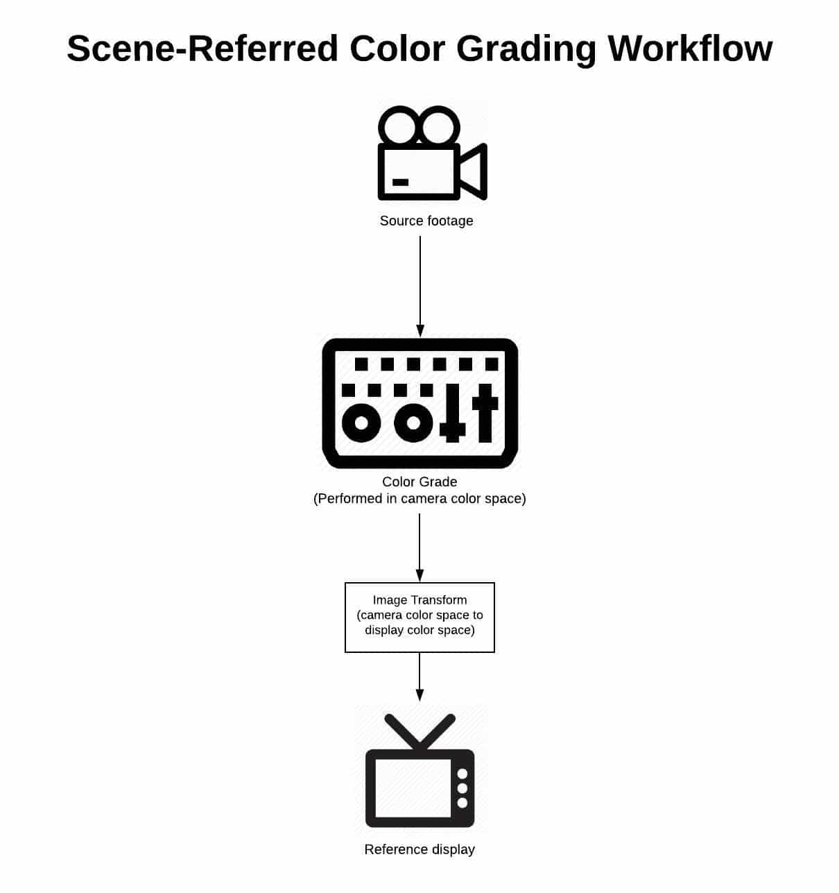
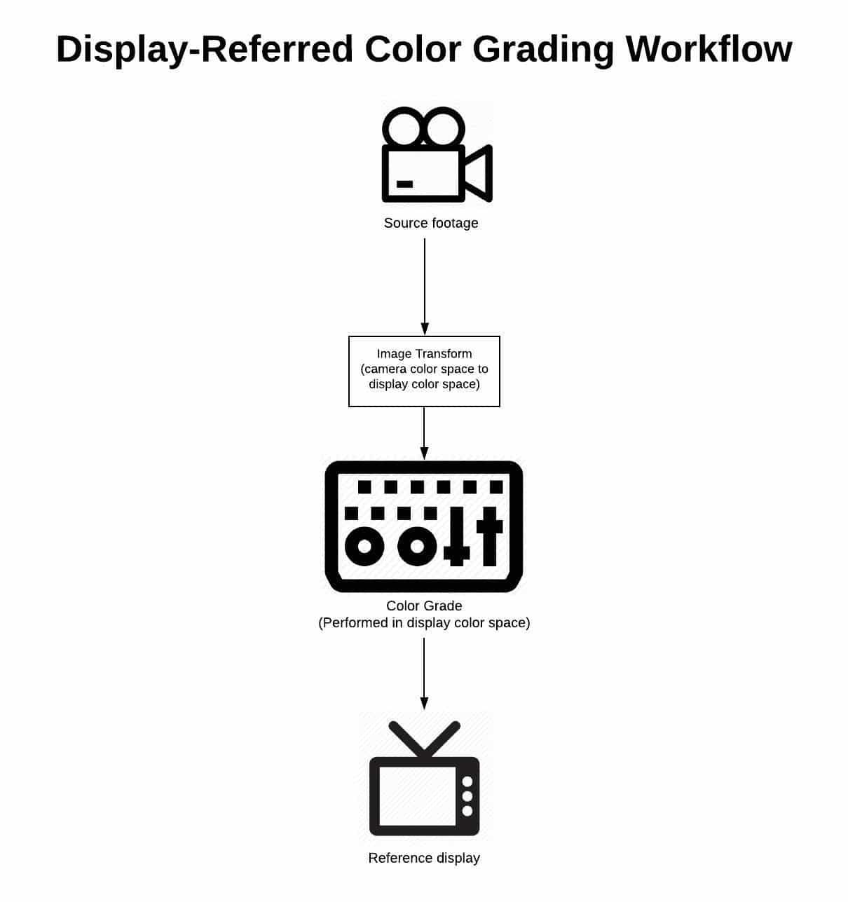
A scene-referred workflow is one in which we manipulate our images prior to their transformation from camera color space to display color space. A display-referred workflow is one in which we manipulate our images after they’ve been transformed from camera color space to display color space.
Easy enough, right? But what impact do these different approaches have on our images? How can we know which is right for us? And how can we practically implement this knowledge in our workflows?
To answer these questions, we need some historical context.
A Bit of History
Modern color grading tools and techniques represent the union of two distinct forms of image mastering: color timing and color correction.
Color timing is a craft nearly as old as filmmaking itself — until the last few decades, it was the sole method by which film images bound for theatrical release were mastered. It is a photochemical laboratory process which manipulates film images through the use of physical light, and it is inherently scene-referred in nature.
Color correction is a younger discipline, made possible with the advent of video imaging. It is an electronic process which manipulates images by altering their encoded signal. Color correction was designed to tweak broadcast images which were already in display color space, and as a result it is an inherently display-referred process.
The history of modern color grading can be understood as a slow merging of these two methodologies, with milestones including telecine (video capture and electronic manipulation of film negative), digital intermediate (digital manipulation of film negative before being printed back to film positive), and the rise of digital cinema cameras. Today, the fusion between color correction and color timing seems complete. Practitioners of both are given the same title (colorist), use the same software, and are expected to be capable of working with film as well as broadcast images. Even the terms themselves have been largely discarded in favor of the more-inclusive heading of color grading.
But the discrepancies between the techniques and philosophy of each discipline are still with us, and can have a huge impact on our work. The choice between working display-referred and scene-referred is a perfect example. In order to successfully navigate this choice, we need to understand the ramifications of each approach, and make a conscious decision in support of our creative vision. So let’s take a look at the pros and cons of each.
Pros and Cons
Display-referred workflows
As we’ve learned in this series, all images undergo a multi-part journey from sensor (or film negative) to screen. A display-referred workflow operates on its images at the very end of that journey — following the transform from camera color space to display color space.
There are several benefits to working in this way. First, it requires virtually no knowledge or implementation of color management — meaning accurate technical transformation between color spaces. It also allows for grading to begin as soon as shots are loaded into the colorist’s software, with virtually no prep or setup required. Finally, with everything being done by hand, it generally feels highly tactile and creative.
These benefits are alluring enough that many colorists and filmmakers never look past them, but they come at high cost, both to the process and the end result. For starters, once transformed into its display state, an image loses much of its dynamic range and color information, affording the artist less flexibility to make clean manipulations. Equally problematic, displays interpret light and color differently than our eyes do, so an image transformed into display color space responds to adjustments in a very non-intuitive way. For example, in display space, operations as simple as an exposure adjustment require the careful manipulation of several different controls in order to get a perceptually linear response. Finally, because they’re not supported by good color management, display-referred workflows place too much burden on our eyes and display — both of which can lie to us in a variety of ways.
Scene-referred workflows
In contrast to display-referred workflows, scene-referred workflows operate on their images in the state they were captured in, i.e. prior to their transformation from camera color space to display color space.
One of the key benefits of scene-referred workflows is the consistency they afford. Because we’re operating upstream of a global transform, images tend to flow from one to another more easily. Working scene-referred also allows for more intuitive adjustments, because we’re operating on the image in a color space similar to that of our vision system. Unlike in a display-referred environment, operations such as exposure and color temperature shifts can be made cleanly and simply with a single knob. Finally, scene-referred workflows give us full access to the dynamic range and color information captured in-camera — much of which is truncated by the time the image is transformed into its display state.
Sounds like the superior choice, right? But what about the cons of this workflow?
There are two key cons to this workflow, which are enough to deter far too many filmmakers from using it. The first is that it requires us to learn the basics of our image’s journey from sensor to screen. The second is that it requires us to lay a proper foundation in our grade before we begin turning knobs. Both of these take time, and neither are very sexy. But the truth is that we owe this diligence to ourselves, our collaborators, and our images. The good news is, you’re more than halfway there by taking the time to read through this series!
Let’s wrap up by looking at the fundamentals of building a scene-referred workflow for your next grade.
Building a Scene-referred Workflow
Building a scene-referred workflow is simpler than it seems: all you’ll need is an edit consisting of footage from a professional or prosumer camera captured in a log format, and a good color grading application such as Blackmagic Design’s Davinci Resolve.
Step 1: Ensure you’re working with footage straight from the camera
When we’re grading, we want access to any and all color information captured on set, so the first step in setting up your grading workflow should be to ensure your timeline contains camera-original media, rather than proxies, transcodes, or exports. These will generally contain less information than the original footage, and often will have LUTs or temp color “baked” in, all of which compromise your ability to master the strongest possible image.
While a discussion of your overall post-production workflow is beyond the scope of this article, I encourage you to test and work this out well in advance, including a plan for relinking to camera-original material if you decide to use a proxy or “offline” workflow.
Step 2: Decide on how you’ll map from camera color space to display color space
There are many ways to transform your images from their camera color space to display color space, including LUTs, and Resolve’s Color Space Transform tool, and manual adjustment. In the case of raw formats such as R3D and ARRIRAW, you can even choose to unpack (or debayer) your raw images directly into display space. Each of these carries its own benefits and caveats, but here are the key criteria for choosing and deploying a transform that will properly serve your scene-referred workflow:
We need to be able to control where in our image pipeline it’s deployed. This disqualifies doing our transform at the initial debayer stage, because once we’ve done so, we have no access to the camera-original scene data while grading.
The transform should be technically sound, meaning it’s set up to receive an image in a color space matching that of our camera (e.g. Arri LogC), and to accurately transform that image into the color space of our display (e.g. Rec 709).
The transform should be consistently applied at the same point in the imaging pipeline for all shots in your timeline.
Step 3: Do your grading prior to your transform from camera color space to display color space
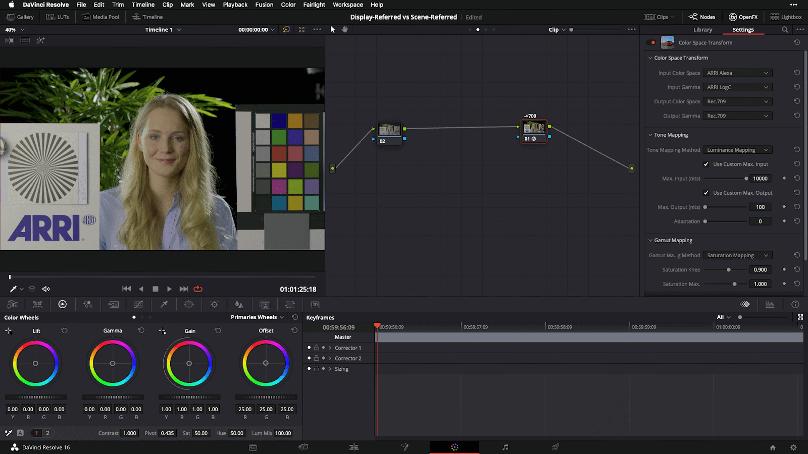
Once you’ve set up your transform in step 2, all you have to do is ensure you do your grading prior to this point in the image pipeline, such that the transform is always the last operation to take place on your image. In Resolve, this simply means creating nodes to the left of this final output transform.
It’s worth noting that if you’re used to working in a display-referred context, your controls will react differently than what you’re used to. But with a bit of practice, you’ll soon find doing your grade in-camera color space to be simpler, more intuitive, and to produce better-looking images.
[Caption: Example scene-referred grading setup in Davinci Resolve, demonstrating a Color Space Transform from Arri LogC camera color space to Rec709 display space]
Closing
I hope it’s clear by now that the advantages of scene-referred workflows far outweigh the convenience of working display-referred. This advantage gets even larger when we consider the increasingly common need to strike deliverables for multiple displays. With a robust scene-referred workflow, we can simply target a different output for our grade, whereas in a display-referred workflow, we essentially have to start over, making subjective adjustments by hand to try and match our look between two or more displays. Educating ourselves on scene-referred workflows and taking the time to set them up is a small investment that pays dividends every time.
Now that we understand the implications of working scene-referred versus display-referred, as well as how to set up a proper workflow for the former, we’re ready to get hands-on with what I call the “Desert Island” tools of color grading — the five basic tools you can accomplish nearly anything with once you understand them. We’ll be covering this in our next installment of this series — see you then!
These momentary onscreen sounds are known as hard effects. In most films, you’ll more often hear unassuming hard effects like a door closing or a car pass-by. They’re typically things on screen making a sound for a short period of time.
That doesn’t mean hard effects can’t have depth. When sound design is executed perfectly, it’s much more than just ear candy; it’s a narrative device with infinite potential.
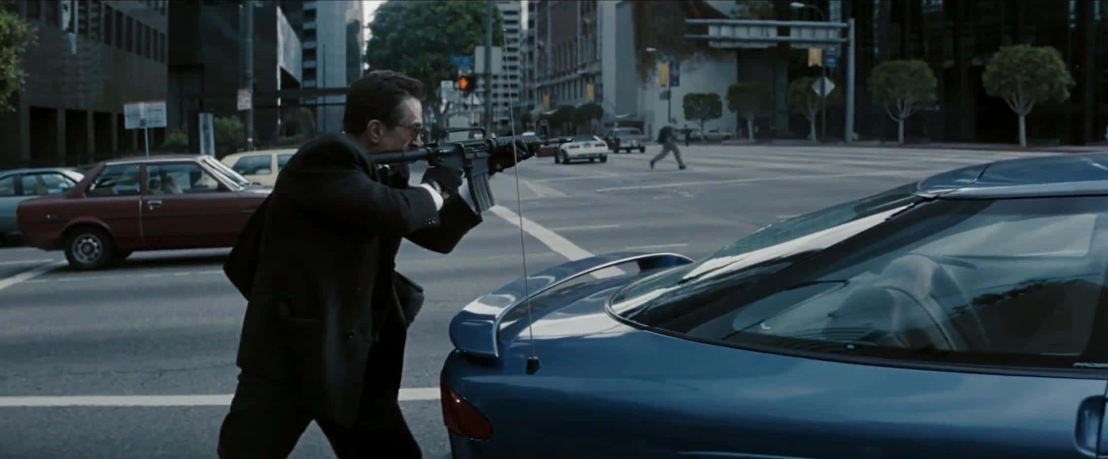
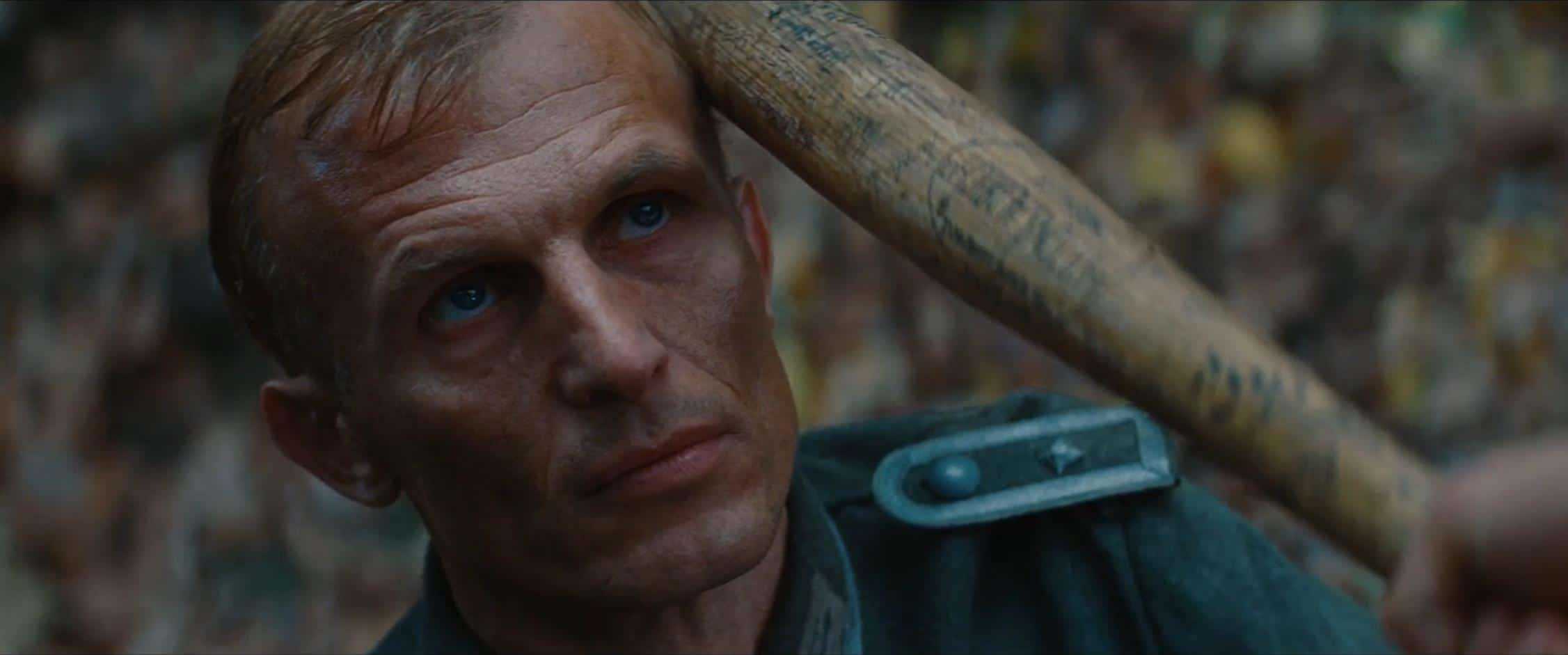
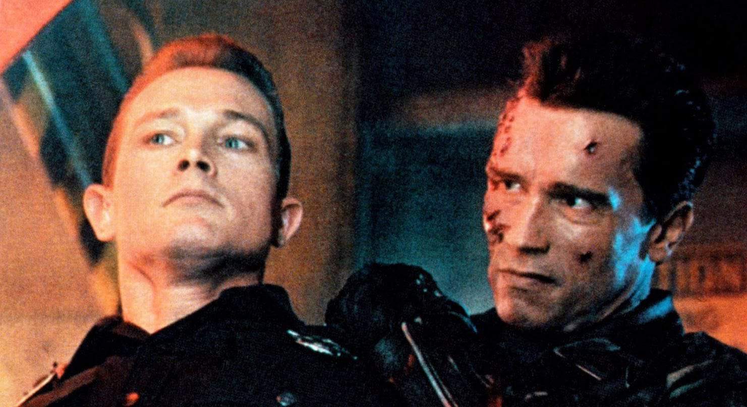
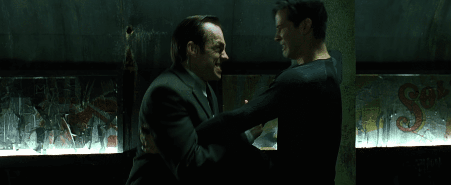
Let’s deconstruct a shotgun blast from Terminator 2: Judgment day.
That sound could have just been a shotgun going off in a hallway, but there’s a lot going on in that blast. And it’s not there just so it can sound massively cool—it’s all there for a reason.
Arnie shoots that same gun 6 more times afterward, but it’s not the same as that first massive blast. The subsequent shots are more bare. They don’t have the canyon echo and the other accoutrements. That’s because that first shotgun blast needed narrative weight.
We, as the audience, have some revelations when that shotgun is first fired:
We see the first literal collision of Terminators searching for John Connor
Arnie wasn’t trying to kill John
That cop we had a weird feeling about is probably a bad guy
That bad guy cop is probably made out of liquid metal
For all those reasons, that first shotgun blast was important. That first shotgun blast needed its close-up in sharp focus. The thoughtful, layered sound design smacked a huge exclamation point on that turning point in the story.
You can’t just tack on this kind of impactful sound design in post-production as an afterthought.
In most cases, it’s the writing, staging, and editing of the scene which allow for that kind of layered, meaningful sound design to happen. It’s important to know that most great sound moments are actually born from the writing and directing. It’s a whole other topic I should cover at a later time.
From the Ordinary to the Hyper-real
Sound designer and re-recording mixer Gary Rydstrom mentions in the video’s commentary that in the early 90s, James Cameron communicated to him the concept of hyper-real—bigger than life sound. It’s crazy to think that was a novel concept 30 years ago. Now we’re neck-deep in Transformers and Marvel type films where there’s no shortage of aural hyper-reality.
But you can have a damn good time with everyday sounds, too.
A couple of years ago I interviewed sound designer Mark Mangini. He won an Oscar in 2015 for supervising the sound on Mad Max: Fury Road. His resume is incredible. You might think I jumped to ask him about the flamethrowing guitar or Furiosa’s war rig, but I was more excited to talk to him about doors.
A door is a ubiquitous object, but it’s also one of the more diverse and complex mechanical devices we interact with every single day. Because of those mechanics, we can use doors as an opportunity to express ideas and emotion.
Mark is a passionate guy and it’s fun to hear him philosophize about sound. I knew mentioning doors to him would get him excited and elicit a great response.
I basically just said to him, “Alright, Mark. Doors… Go!”
What followed is this 2-minute gem.
Sound Design of a Scene
Before you started reading this, it may have already been obvious to you that sound design could be a light saber or a T-Rex roar. But if you think about sound design as having an arc over the duration of a film, we’re now getting into the scope of what sound design actually is.
Sound design is everything you hear.
That’s actually the first definition of sound design, says Walter Murch, the first-ever credited sound designer ever (for Coppola’s Apocalypse Now). In his words:
“Just like a production designer arranges things in the 3-D space of the set, and makes it interesting to look at, I’m essentially doing the same thing with the 3-D [aural] space of the theater. Where am I going to use it in full, and where am I not going to use it? Where are we going to hold back, and where do we expand and contract?”
Only later did it start meaning the creation of sounds that we’ve never heard before.
Here’s an exciting hand to hand combat scene from Terminator 2 chock full of badass, yet thoughtful sounds.
In that scene, you obviously heard a lot of great hard effects; but let’s think about how sound develops over the course of the scene.
The first thing to notice is how quietly it all starts.
The sounds of the Terminator’s footsteps/leather/zippers/buckles help to inform the audience how quiet it is. The suspense builds until the T-1000 lunges from out of nowhere and triggers a tense melee. T2 as a film uses the juxtaposition of LOUD quiet LOUD often, and it’s an example of one of our most powerful cinematic tools.
Contrast.
You can’t have an effective loud moment without a quiet moment. The most powerful chorus of a song comes after the stark, quiet verse. The most terrifying sound in the world can be made to be even more spine chilling if there was pleasant, soothing wind before it.
Another sound detail is what isn’t in the scene. There’s zero dialogue. But wait. Not only is there no dialogue but there aren’t even the sound of “efforts.” Efforts are vocalizations of exertion or pain—the “UNH!” when someone throws a punch, or a “HNNG!” when lifting a heavy object.
What we don’t hear in the scene is also important, and tells us things about the characters and the story.
You see, the company that created the terminators, Cyberdyne, got some things wrong when programming these machines. When they exert themselves, they don’t vocalize. They don’t scream out in pain. They don’t pant in exhaustion. (Do terminators even breathe?)
It’s one of the things that makes the terminators seem oddly unhuman. Cyberdyne’s bug is actually a feature of T2’s soundtrack. The terminators’ disturbing silence is one way they reveal their lack of humanity.
Even the ambience track is reacting to the action you’re seeing. Everything surrounding the scene is made to be alive, giving you information and moving the scene forward for you to react to the story.
As things get weirder and more intense in the scene, so does the environment. Those environmental sounds are also foreshadowing the mechanical clunking of the gears that the T-800 ultimately gets trapped in. It’s a smooth and invisible transition, much like music in a film, the audience shouldn’t notice when it’s entering or exiting a scene. We want it to gently manipulate our emotions without our detecting the seams.
Walter Murch said it best:
“The visual material knocks on the front door … Sound tends to come in the back door, or sometimes even sneak in through the windows or through the floorboards.”
There is Sound Design in Music
Speaking of music, the Terminator 2 score is notable. It utilizes lots of metal and mechanical sounds that fit perfectly in with the themes of the film. You can’t underestimate the sound design aspect of your score to also support the content and themes of your story. The composer of T2’s score, Brad Fiedel, has some interesting words about how he walked the line between music and sound design.
“One director I’d worked with in the past came out of the Hollywood premiere screening of [T2] saying, ‘This is definitely starting a new era off.’ He was referring to the kind of seamless relationship between music and sound effects, because he couldn’t tell the difference between what I had done and what they had done, and in some cases, there were things I did that were very much sound effects in a sense, though I didn’t intend them to be.” – Brad Fiedel, Composer, Terminator 2: Judgment Day
For a fantastic deep dive into T2’s score (and one of the best Arnie impressions out there) check out Alex Ball’s amazing video.
By the way, Brad Fiedel’s director friend was right. We’re in an era now where music is being completely embraced as another opportunity for sound design. Bombastic, melodic orchestral cues are often replaced with textural mood pieces. Terminator 2 was one of the first blockbusters to really pull it off in the mainstream.
Sound Design Can be an Entire Film
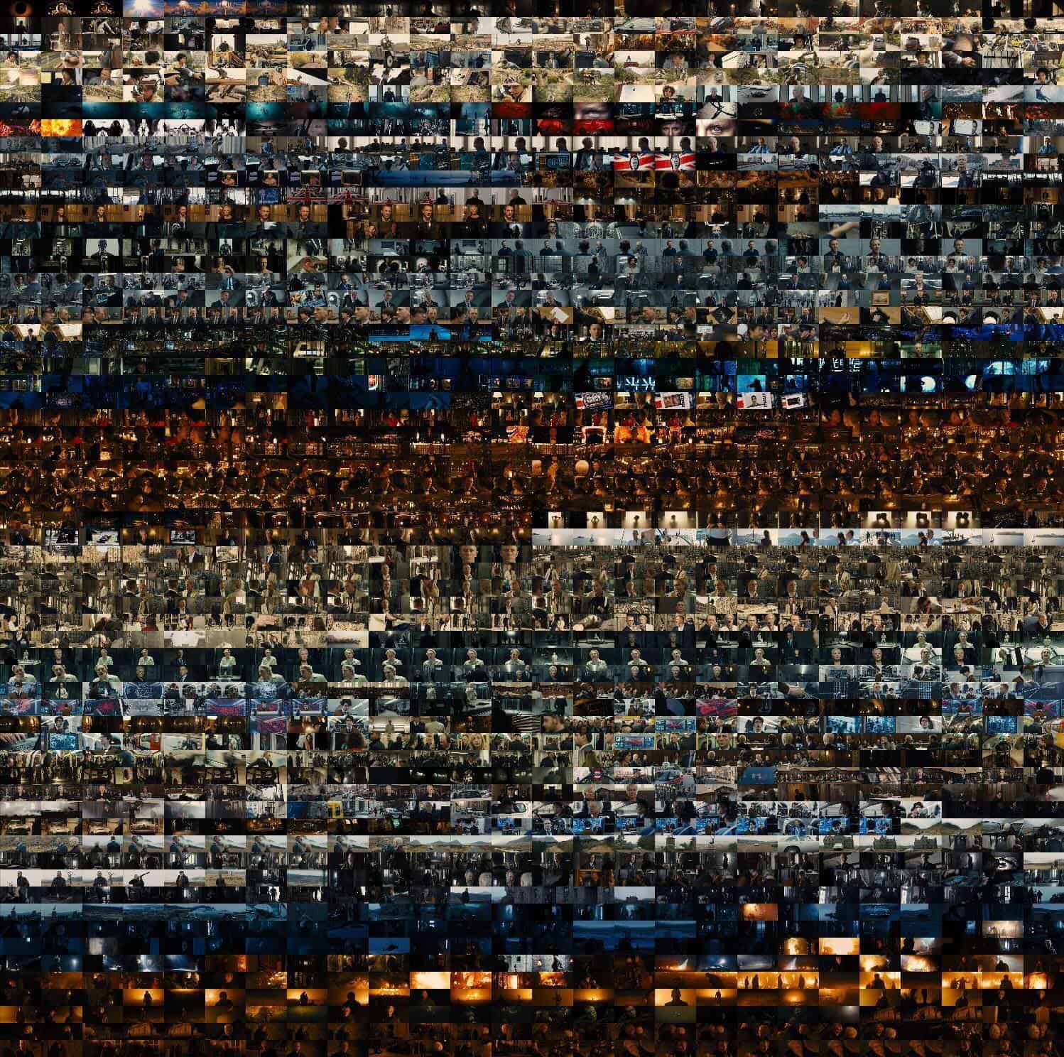
You may be familiar with this image that made the internet rounds a few years back.
The color pattern of the James Bond film Skyfall (2012) revealed
The image contains a frame of every shot in the James Bond film Skyfall. When you see those frames together in a single image, a hidden pattern in the film’s cinematography and color grade reveals itself. By seeing the film in this way we see a clear, deliberate visual arc that is expressed over the entire 144-minute film.
Although less obvious, sound design can communicate with a similar aural arc.
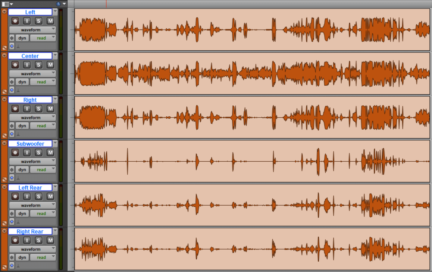
Here’s a visual representation of the 5.1 Surround Sound stems of Skyfall.
Hmm, does this help? Nevermind.
OK, so, waveforms don’t really give us the best example of this.
A better example is from the film The Matrix. The film’s sound designer Dane Davis talks about how the sound design of the fight scenes (whooshes, punches, kicks, impacts) over the course of the film create its own arc. In his words:
“We wanted to have a developmental arc from the first fight to the last fight so that we didn’t use up our whole arsenal [of sound effects] right off the top with this first training fight. We kept it deliberately very restrained and pretty naturalistic, comparatively speaking, so that in the final sequence between Smith and Neo in the subway station we could pull out all the stops and make that extremely physical and huge and explosive and painful on every level.“ ~ -Dane Davis, Sound Designer, The Matrix
Restrained, naturalistic.
Huge, explosive, painful on every level.
See this Instagram post by INDEPTH Sound Design to dive deeper into the sound of The Matrix:
All of the above examples are, of course, massive Hollywood blockbusters. These are the types of films that come to mind when people think of sound design. In fact, every film I’ve mentioned in this post won an Oscar for either Best Sound Mixing or Best Sound Editing.
But only using this type of sound design in massive films doesn’t have to be the case. It shouldn’t be the case. The concepts I’ve mentioned work for all films and, really, they’re the very essence of cinema.
Sound Design Can be Expansive
In the original Star Wars trilogy, there’s a substantial sound design arc that takes place over the course of all three films, although you might not notice it.
In Episode IV, Ben Burtt and George Lucas noticed that the sound of light saber fights had a musical quality. For those scenes, they decided to forgo music altogether. They enjoyed the musicality and the raw credibility the sound of the light sabers projected. Consequently, John Williams was able to take a much-deserved break for those scenes.
But as the trilogy builds, and the connections between Luke and Vader grow, more and more music finds its way into those scenes. The music builds on top of that strong foundation of the light saber sounds to culminate in Luke making amends with his father. So don’t let sound design limit you to the scope of a moment, a scene, or even an entire film.
The same thing happened in The Matrix trilogy. No one knew there would be two more sequels, so sound designer Dane Davis would have to extend the developmental arc of the fight scenes even further. Dane says:
“As it turns out, because of the two sequels [to The Matrix], we had to, in fact, extend that arc another five hours to the end of “Matrix Revolutions,” at which point we were cutting in cannon blasts and you name it to make those hits between Smith and Neo in the air even more powerful than anything else you’d heard in the previous two movies.”
Try it Yourself
Maybe your comedy short isn’t full of bigger-than-life violence or sci-fi vehicles, but some moments, even entire scenes, might beg you to take the sound design to a tasteful place of hyper-reality to extract those extra laughs. Your dramatic romance film might necessitate a horror-esque wind howl to tell the audience something or create aural interest and style. After that, challenge yourself to take your cinematic sound beyond just the moments.
If Mark Mangini can get excited about doors, any kind of film can utilize exciting sound design.
To be cinematic is to be bold with sound. Go the extra mile!
Visual effects are more accessible and versatile than ever—but there’s no substitute for quality practical effects. This article is about a quest to avoid digital effects that led me to build a full-scale WWII fighter plane cockpit for a 90-second Internet video.
Making of Mustang
Sometimes you just have to go for it, and by the summer of 2018, I seemed to have exhausted all other options. Designing and building a full-scale, gimbaled WWII fighter plane cockpit and instrument panel mockup was so far afield of anything I had attempted before that it seemed impossibly out of reach. Yet I couldn’t come up with another way to get the shots I wanted.
A real Mustang on the ground? Static lighting and too many anachronisms.
In the air? Too expensive, unwieldy, and hard to mount a camera.
An existing Mustang cockpit mockup? I couldn’t find one with all the features I needed.
A CGI cockpit? I don’t think so!
No, the only way to get the shots I wanted would be to specially build a gimbaled cockpit mockup—and on my budget, I’d have to do it myself. I didn’t know how I’d get there, or even where to begin. But after months of searching in vain for an alternative approach, I had finally decided that it was necessary.
Early storyboard frames I drew up to help plan the project. I storyboarded in 2.39:1 but changed the aspect ratio to 1.78:1 after noticing in camera tests that vertical motion played much better in a taller frame.
I would wind up spending the next 10 months poring over old engineering drawings, researching related films and period documentaries, designing, stress simulating, redesigning, building, wiring up, programming, and dressing a single prop. All for a 4-hour shoot with the actor, a few pickup shots, and some VFX plates that would be cut into a 90-second finished product. Crazy? Maybe. But I didn’t know what I was getting myself into at the time.
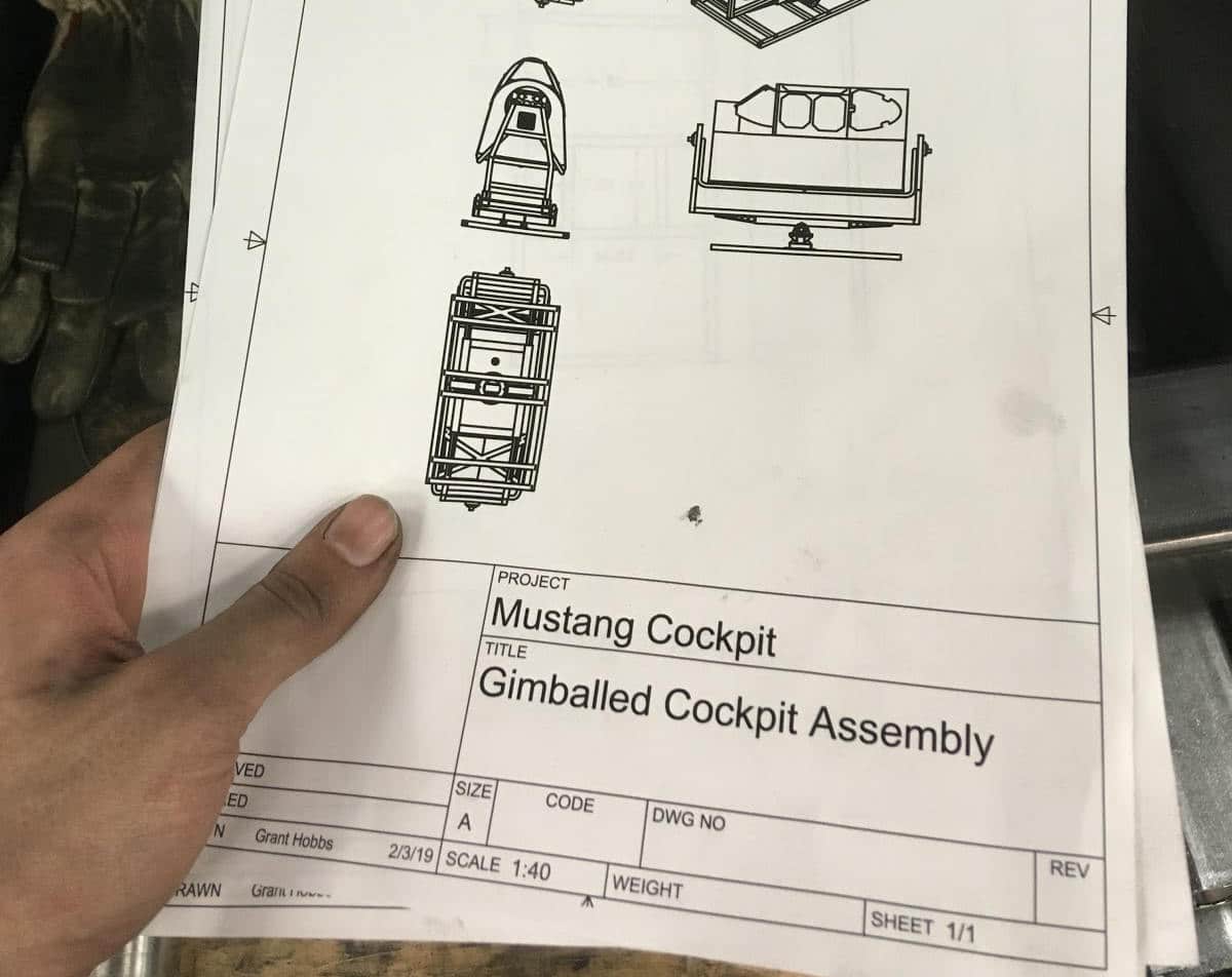
Example of the engineering drawings on which I based the design of the cockpit
Rewinding for a bit, the idea for the project came up in the summer of 2017. I had put together a handful of book promos for novelist and historian John J. Dwyer over the preceding years—each one more elaborate than the last—and for his latest novel, we wanted to do something a little different. Mustang tells the story of Mennonite farm boy Lance Roark, who leaves his small town and pacifist upbringing to join the USAAF in the fight against the Axis powers—and eventually, become an ace fighter pilot. Instead of a movie trailer-inspired approach, we decided to go with something shorter and more abstract, leaning heavily on visuals, period music, and scenes from the book.
What really pushed the complexity of this project over the edge, though, was our shared enthusiasm for Dunkirk. Seeing Dunkirk in spectacular 70mm IMAX had left me glowing with enthusiasm over the refreshingly tactile physicality it achieved—across the board, but particularly in the dogfight sequences. In my estimation, Dunkirk raised the bar for fighter cockpit scenes and exposed where many other films—even films with massive budgets—had fallen short. So when we began tossing around ideas for Mustang I immediately thought, “OK, we’re going to do something with a cockpit.”
Building a gimbaled fighter plane cockpit
At first, I had no idea this would involve actually building one; I was under the impression that I could get away with simply shooting in a real P-51 on the ground in front of a green screen. But by the time I had storyboarded the sequence and secured permission to film in a couple of Mustang cockpits, I realized there were several big problems with this approach:
Most P-51s flying today have somewhat obvious anachronisms that would have shown up in the shots I needed—modern instruments and lack of the prominent reflector gunsight being the two main ones.
The instrument panel was going to feature fairly prominently, and the instruments on a real airplane would have been distractingly still if we were shooting on the ground.
While the scene didn’t require the lighting to change all that much over time, I was concerned that a 100% static orientation of the sun/sky with respect to the cockpit would have been a dead giveaway that we were shooting on the ground.
It would have been risky to rig up a backdrop and other equipment in a short amount of time around someone else’s multimillion-dollar aircraft / priceless historical artifact.
Even if I could otherwise manage the lavish expense and complicated logistics of shooting in a real flying Mustang, I’d still face issues mounting the camera, dealing with obvious postwar modifications, and so on.
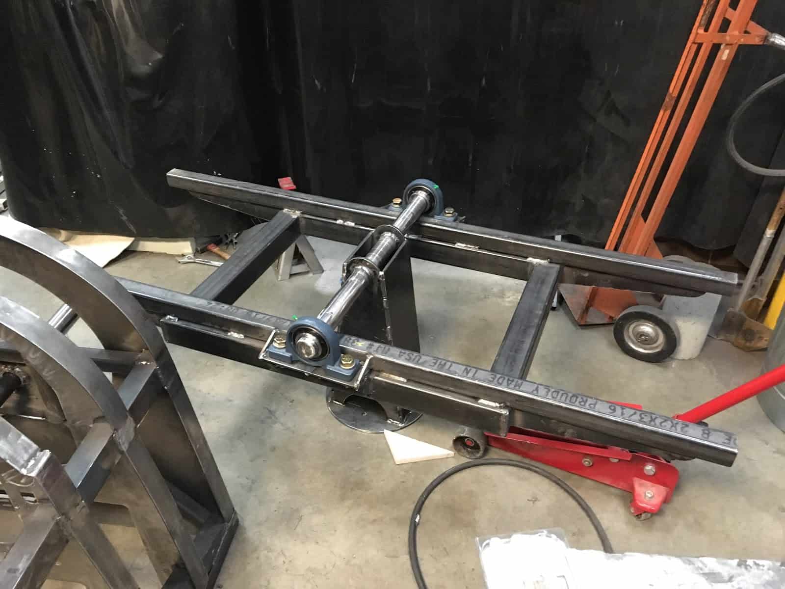
The pitch axis platform of the gimbal is assembled for the first time. Left of frame, the cockpit is ready to be mounted.
Having reflected on all that, I would likely have abandoned the project at this point—except for two things. First, I had read about a technique used by production designer Nathan Crowley, Christopher Nolan, the folks at Scroggins Aviation, and the rest of the Dunkirk crew where they had built this manually-operated, gimbaled Spitfire cockpit that could be setup on some bluffs overlooking the ocean. Somehow this low-tech solution seemed much more accessible than a cockpit mockup on a hydraulic motion base. Second, I had recently seen a short film by Andrew Finch calledOthers Will Follow (a “Short of the Week” selection), for which he built his own spaceship set—along with a bunch of other insanely impressive stuff.
I had no fabrication experience going into this, and would probably have dismissed the cockpit idea out-of-hand were it not for Andrew’s example. It should go without saying that I did not simply assume that I would succeed in pulling off a gimbaled Mustang cockpit just because of Andrew’s space-ship-building success—but crucially, it did make me think, “Maybe it isn’t impossible.” And so, after weeks of searching in vain for an easier way, I did the only thing left for me to do—I took a great plunge into the unknown.
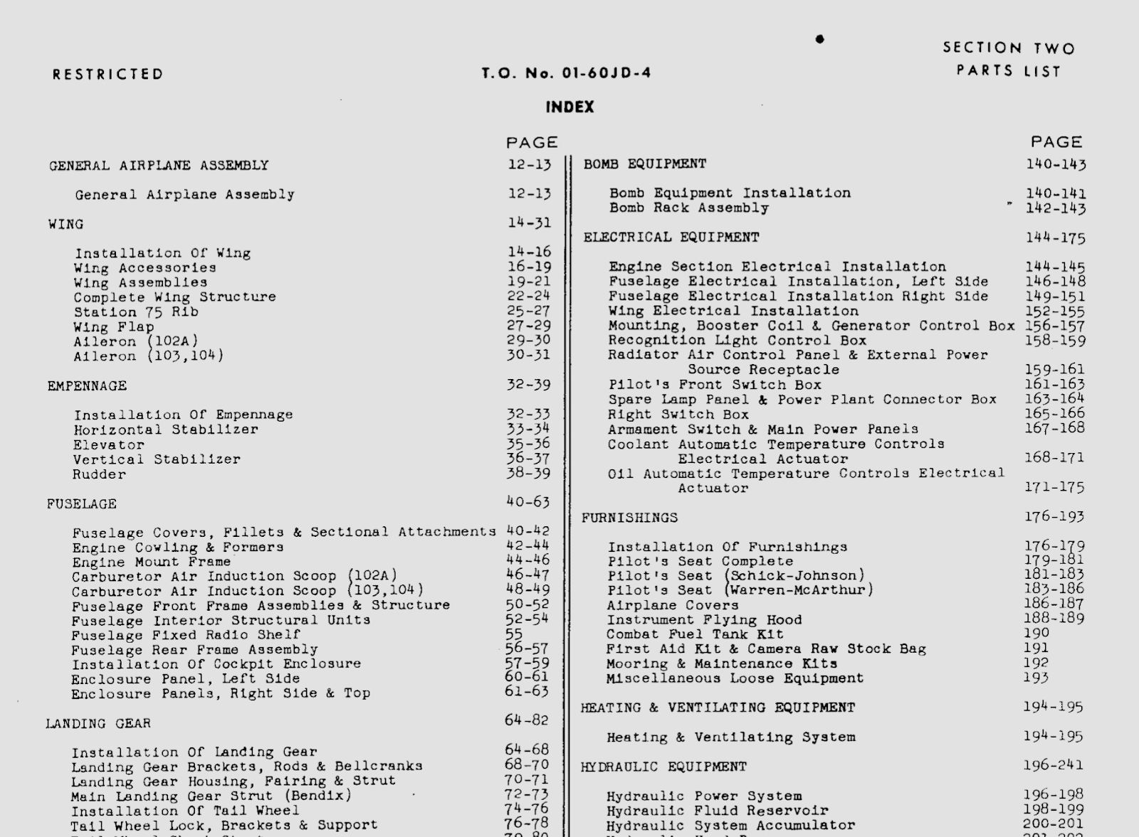
Index of a P-51 Mustang parts catalog, a document that proved invaluable for tracking down engineering drawings for various parts of the cockpit.
Now to give you some idea as to just how much of a plunge this was, you need to know that I had never used CAD software before, or worked with engineering drawings, or picked up a welding torch, or worked in a machine shop, a metal shop, a woodshop, or an electronics lab, or even walked into a metal or aviation supply store. Naively, I thought CAD would be easy because I was somewhat comfortable with polygonal modeling for CGI, and I imagined fabricating a structure with a welding torch would be pretty much like using a big glue gun. In short, I knew just enough to take the first step, and I thought (well, hoped) that the rest would fall into place easily enough. Boy, was I wrong.
I joined a local makerspace to solve a major tool shortage problem that became apparent around this time, and began working on the instrument panel. Since Finch was a friend of a friend, I was able to get in contact with him. He had advised me that this would likely be the hardest piece, but it was also least intimidating to me due to its relatively small size—so it seemed a good place to start. After a month or two (and a few failed prototypes), I wound up with a working panel.
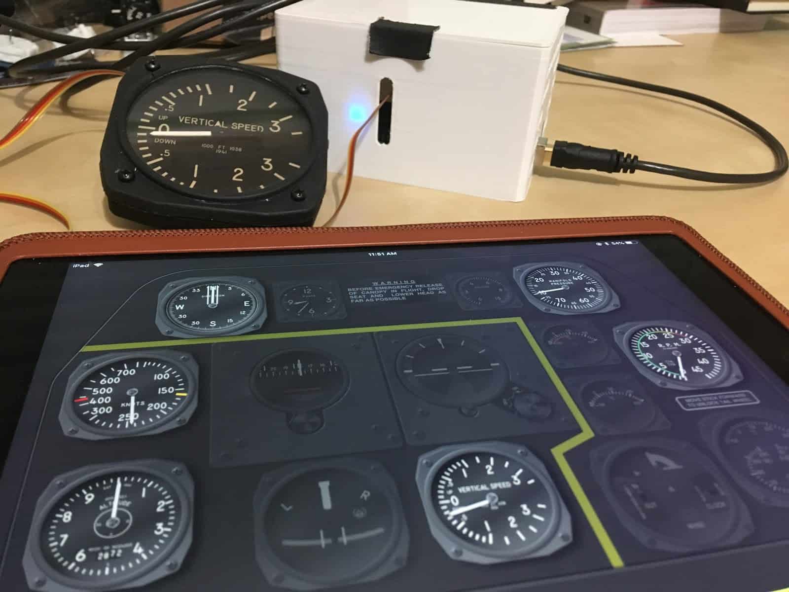
Since I was going to be mounting the cockpit on a gimbal, I realized I could use real, working instruments—in some cases, with no modifications. This was convenient both because these instruments would have been among the hardest to fabricate and because I would automatically get perfect coordination between, for instance, the artificial horizon, the turn and slip indicator, and shifts in lighting direction relative to the panel.
Early test of the control interface for the electronic instruments
Six of the instruments were 3D-printed custom mockups with laser-cut acrylic “glass” and repurposed car gauge motors powered by a custom-built Bluetooth control box and controlled by an iPad app. (The iPad app might seem unnecessary, but it allowed me to easily adjust instrument behavior on the fly.)
Cutting out the main sheets that would be placed down the length of the cockpit.
About two or three more months after finishing the instrument panel, I had finally pieced together what I felt was a plausible design for the cockpit and gimbal. As I mentioned, I was completely new to most of this stuff—and the viability of the project was saved many times over by insights, suggestions, and tips from fellow Dallas Makerspace members with knowledge in fields ranging from machining, to metallurgy, to sculpting, to electronics, to mechanical engineering.
In particular, fabricator David Schirato of Electric Monkey Garage was overwhelmingly generous with his time, hard work, and expertise. Besides helping out on long days and late nights, David proved an invaluable source of knowledge about the craft of sourcing, measuring, cutting, and assembling metal—and I’m not sure how I would ever have finished this project without his help.
David Schirato inspecting gimbal base just after first assembly
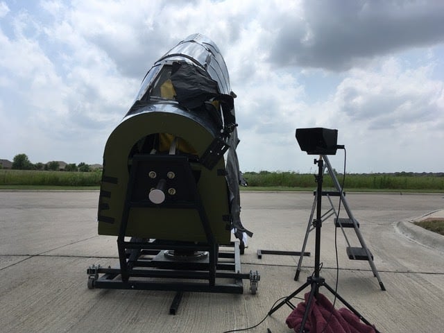
Even with help though, this was not a small project. After an already months-long research and design phase, the cockpit and gimbal took over four more months to complete—but eventually, with the cockpit ready-to-go, I was able to begin conducting camera tests.
The cockpit at the shooting location
Putting it all together
Early on in the project, I became dead set on keeping manipulation in post to a bare minimum—but in the end, I wound up resorting to VFX in quite a few places to fix problems, enhance practical effects, and create some of the exterior scenery.
Of course, the main point of building the gimbaled cockpit was that it would provide rear-facing shots of the pilot mostly in-camera. But on my budget, I wasn’t going to get a POV through a reflector gunsight flying through the air chasing a smoking Me 109 in-camera—most of the POV shots would have to be some kind of composite. I experimented briefly with front projection—by which I hoped to gain realistic glancing reflections—but green screen turned out to be a better choice in this case since it allowed the use of natural sky for lighting. And as it happens, the most realistic way to light a daytime flying scene is with a daytime sky.
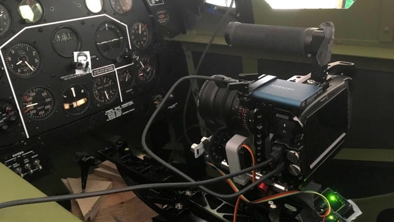
To get the push-in towards the picture instrument panel, I had to coordinate 3 axes of cockpit rotation, camera slider movement and focus inside the rotating cockpit, and operation of the electronic and pneumatic instruments. I experimented with a DIY electronic follow focus connected to an ultrasonic range finder (which was able to keep the instrument panel in focus), but switched to an off-the-shelf follow focus system to be able to get the shot of the hand touching the photo without losing focus on the panel.
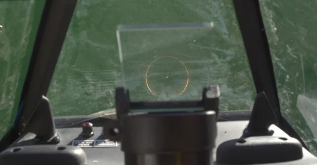
I was still able to get quite a bit in-camera though, even on the green screen shots. One really neat thing that I’m glad worked out is that I was able to find a real, functioning WWII-era reflector gunsight body, mount it into the cockpit, and capture the reflected reticle pattern in-camera. It was a little tricky to composite, but I think the effort paid off versus the alternative of adding it in post. As a bonus, for handheld shots, the reticle doubled as a nice virtual tracking pattern at infinity, which came in handy for integrating the background plate.
Foreground plate for Me 109 attack shot
Here’s the finished composite:
For a POV shot showing passing wisps of cloud, I pointed the cockpit skyward, mounted a camera in the cockpit shooting 5fps, and set off white smoke grenades on a windy day.
I even explored the idea of using practical birds, but it turns out there are laws against capturing birds in Texas, and I think getting them to fly in the right direction would have been really hard (not to mention possibly inhumane). So I just made them in Blender.
CGI exterior environments were mostly done in Terragen and other elements were animated in Blender and rendered in Cycles and Octane using mostly stock 3D assets. I made use of reference material from Dunkirk, WWII gun camera footage, and William Wyler’s wartime documentary Memphis Belle to get a better feel for how to execute some of these shots, though the final look wound up being dictated as much by my limited animation skills as anything else. (By the way, the recently scanned original 16mm Kodachrome source footage for Memphis Belle—much better-quality than any surviving print—is available for free via The National Archives.)
A 108-core mini render farm on AWS cranks out some of the more computationally intensive VFX elements
The smoking Me 109 in Blender.
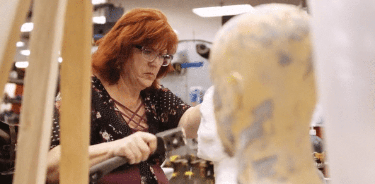
A couple of practical effects shots didn’t involve the use of the cockpit at all but probably ought to be mentioned: the burning corpse and the spontaneously combusting picture. For the burning corpse shot, fellow Makerspace member Kris Anderson sculpted a clay bust of a burnt corpse, cast it in plaster, and coated it in a resin to prevent it from absorbing fuel (so I’d have multiple takes). I used rubber cement painted onto the bust, black smoke grenades, and a flame bar a couple of feet in front of the bust to get the shot. I wanted to rim light the bust to help it stand out more and add more background elements for depth, but this turned out tricker than I expected. I was working in a relatively small space, it was very difficult to predict how the dark smoke would affect the light, and I was already having to line up the timing on several things with only enough smoke grenades for a few takes. So after a couple of takes with badly illuminated smoke, I wound up simplifying this shot and lighting with only the fire.
Kris Anderson working on the burnt corpse sculpture
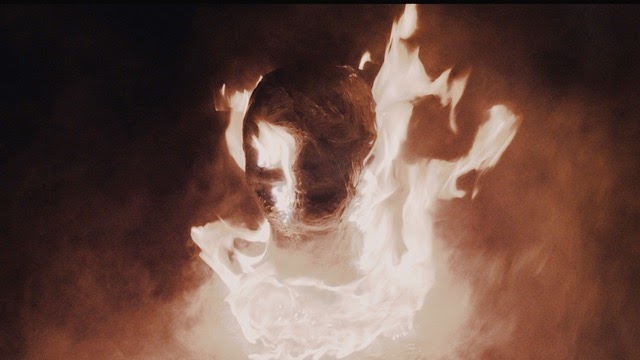
The finished shot. If I were to do it over again, I would have found a larger space and added flame bars and maybe some stacks of concrete blocks in the background for more depth. I think background flames filtering through the whirling black smoke would have looked fantastic.
The spontaneously combusting picture was a composite of the detailed instrument panel and a foreground element made with a spare sheet of metal painted black with a hole drilled just behind the picture. I used a propane torch from behind the metal plate to ignite the picture through the hole, and composited in the burning picture over one of the other instrument panel shots. It would have been technically possible to get this shot in-camera, but that would have risked damaging the vintage instruments as well as the surface finish of the panel, meaning multiple takes would have required additional panels.
Unused take of the foreground plate showing the remains of a previous take (right)
Finished composite
Lessons learned
The effects took most of my time, and just about every shot has things I would tackle differently next time. But perhaps my biggest takeaway from this project is something that came up after I had finished it—or thought I had. When I asked some friends to be a test audience, absolutely none of them (not one) independently picked up on the main things I thought were essential to the piece working.
For example, there was supposed to be a kind of vague, surreal connection between the girl in the photo, the girl on the radio, and an unusual sequence of events taking place outside the aircraft—and that seemed to be completely lost on viewers. To make matters worse, the identity of the burning corpse, which I intended to be the girl, was usually taken to be the pilot. These may seem like small problems, but there seemed to be a subtle logic to the structure in my head that I thought gave everything a kind of poetic unity. When I finally realized that nobody else was picking up on enough of the cues to form a similar mental picture, I couldn’t figure out what was left to hold the piece together.
In retrospect, I think this was to be expected due to the short length of the piece, the kinds of things I was hoping to convey, the complete lack of dialogue, the high complexity of producing each shot, and my own lack of experience. When living and breathing a project for any extended amount of time, some loss of perspective is inevitable—and in my case, I think the problem was particularly acute due to the extreme work time to runtime ratio (somewhere around four days per second) and the fact that I was doing most of the work for each shot myself. That loss of perspective is one cost I definitely didn’t budget for.
Here’s me messing around with an interior camera position I didn’t wind up having time for on the shoot day. With the low angle, you can get away with a lot more roll before the horizon comes into frame, you don’t have to deal with reflections of what is behind the camera, and you can get away with a less wide-open location.
For all my tendency to think you can save money by doing things yourself, this was not an inexpensive excursion, nor did it take anything less than an extravagant amount of time. A year later, it’s hard to see how the 90-second finished piece by itself could justify over a year of work—but harder still to put a price on lessons learned and people met along the way. Sometimes, when the work ahead seemed especially daunting or when progress became unbearably slow, I couldn’t help but wonder whether I had taken things too far.
In the end though, I don’t regret it. Who knows—the cockpit may see a second life someday. But for now, I’m satisfied with what I managed to pull off given what I had to work with. And I sure did learn a lot!
There are many schools of thought about creating spec work in the creative world as a strategy for landing that cool post-production gig. I’d like to address one way of looking at it that will be a unique perspective.
Spec work is like “dressing” for the job you want
In my early years, I remembered hearing, “Dress for the job you want.” It was funny to me because some of those early jobs were before I started college and found my love of art and animation. I was mostly in data management jobs to replace broken drumsticks and buy electronics—meaning that the thought of putting on a tie and getting a taupe-colored office with “hang in there” kitten posters was laughable.
It wasn’t until I was out in the world trying to land a spot at a high-end agency that the phrase started to make sense. Not in the area of fashion, but in the root of what the idea was expressing. There aren’t a lot (if any) agencies that will hire someone right out of college without proof of skill in their given field. At that time, I was finding it hard to land freelance and contract work at the beginning to get the career started. It’s that weird circle where you need work to get work, but you can’t get work until you have work to show. It was really hard to figure out.
Around this time is when Royale (the agency of my dreams at the time) created the iconic iPod Nano commercial with the multi-colored 3D streaks that followed along with the performance of the dancers. I remember seeing it on every art, film, design, animation, VFX publication, and website on the planet. It became the thing all agencies wanted in their toolbox.
I feel like I caught onto that pretty quick and began to research and teach myself how to accomplish that look. I knew it was a trend and wouldn’t last long. But I felt like if I could accomplish that look on my own while it was still hot, then show it to agencies, I could possibly land a job, or at least something contract or part-time. If I could teach myself this skill and “dress” for the job I wanted, I had a good chance of getting it.
Dressing for the job I wanted ended up shaping a lot of my career from that point to where I’m at now. At some point, the goal became to dive more into animated show assets as I started seeing more YouTube shows and podcasts take off. The dream became, “I have to build opening bumpers that resembled all I was seeing on Revision3’s lineup.”
So, I reached out to Eden Soto who was the creative behind a lot of Revision3’s show assets at the time. I asked him a ton of questions and the majority of his responses all pointed to the same idea. “If you want to make show assets, make show assets. Fake a show and do the work. Prove to yourself and potential clients that you can do it by doing it.” Again, dress for the job you want. Put the work in unasked and build that portfolio, then pitch yourself and your skill to land the work.
So, I took Eden’s advice and started to create fake show opens and show assets like lower thirds and full-screen transitions. Around that time, Ryan was already dreaming up and planning what would now be Film Riot. He had suggested I spend some time and build out the show’s animation package. I took the opportunity and knocked it out as best I could with where I was skills-wise.
Taking that opportunity to work for free on something I wanted to someday make a career opened doors I didn’t expect. The show came out and I almost immediately started getting requests to build assets for other shows. It was wild. I couldn’t believe the connections that opportunity afforded me, and how much of my career would be built on the back of the work we did over 10 years ago.
But I “dressed” for the job I wanted. I got to create in front of what ended up being a lot of people with the same types of needs for their shows and podcasts.
As time went on, trends and ads would catch my eye that would inspire me to adopt those ideas and techniques and parlay into paid work. However, before I could jump onto a team and create, I needed to cut my teeth in my free time on whatever the look was. There was a time it would be by building mock shoe ads and animations. Fake full-page cellphone magazine spots. UI/UX (user interaction and user experience) animations and interactions for mobile apps and video games.
Before I could get jobs doing any of these things, I’d first have to dress for the job I wanted. That meant learning how to do these things and build real-world examples of how I could solve potential problems agencies and clients had.
To this day I continue to learn and adapt. Trying to constantly grow and pivot to the needs of the market, while trying to fit positions and roles clients and agencies would need. But it doesn’t come simply because I want it. Like I heard all those years ago, if there’s a job I want, I had better put in the work and dress for that job. If there’s a career or skill you want to have, I’d encourage you to do the same. Identify where you want to be and “dress” for it. Prepare yourself and put the work in.
These days, camera manufacturers are obsessed with adding “k’s” to their resolutions and offering progressively higher frame rates for better slow-mo capabilities. And sure, this has revealed a new world of possibilities for post-production effects; but it’s also had unintentional consequences.
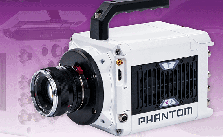
The Phantom T1340 has a maximum FPS of 113,510!
Our fascination with the latest and greatest technology has consigned other techniques to the background of our minds, where they lay forgotten and gather dust. One of my favorite long-lost techniques is under-cranking.
In the right hands, under-cranking can add a natural motion blur to your hyper lapse or give product videos a snappier, more engaging style. Because it’s not used that often, under-cranking almost always stands out when compared to more modern filmmaking trends.
Let’s explore how under-cranking works and a few examples of how you can use it in your projects.
What is under-cranking, exactly?
Back in the day, camera operators had to crank a handle to roll film through the camera. It seems like a tiring, thankless process.
If the camera was cranked quickly, more footage was exposed, which meant more frames and a more detailed look with slower movements. Welcome to over-cranking. If our camera guy cranked his camera slowly, fewer frames would be captured and movements would look jerky and sporadic. This technique was dubbed under-cranking.
Everyone knows the story of over-cranking, because it went on to become what we think of as slow motion, (i.e.. the obsession of every camera company).
But under-cranking stayed around too, and it found a steady job in action films. After all, fewer frames produces faster looking movement.
This is particularly relevant when you’re shooting a fight scene. You’re not going to want actors (or their stunt doubles) going full speed during the take — unless you’re alright with someone taking a full-force roundhouse kick to the face.
Instead, you under-crank the camera, capture fewer frames, and film the shot in a way that accelerates movement. You get the same intense effect without the risk of bodily injury.
To be clear, we’re talking about in-camera under-cranking. You’re slowing the frames per second (FPS) down to between 22 or 20.
Now that you’ve got a better grasp of under-cranking, let’s look at a few different applications of these techniques.
Making Action Even More Intense
Action sequences are the most obvious use of under-cranking. As the last section mentioned, shooting at a slower FPS when recording fight sequences is a longstanding use case.
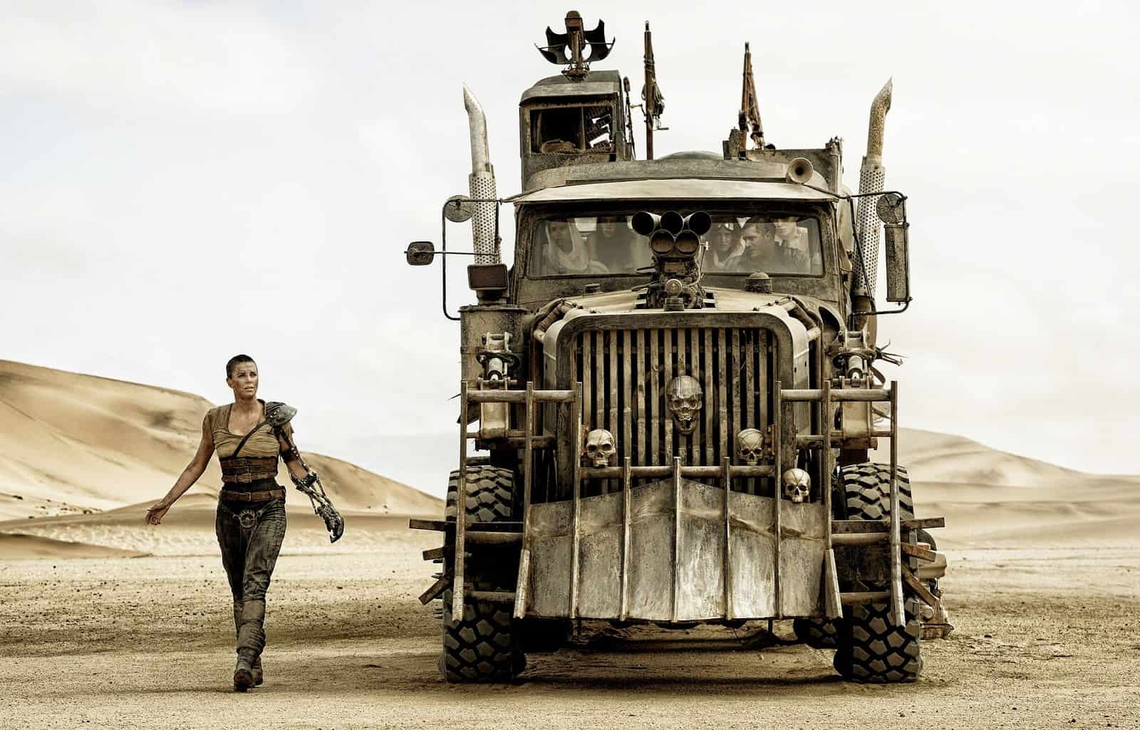
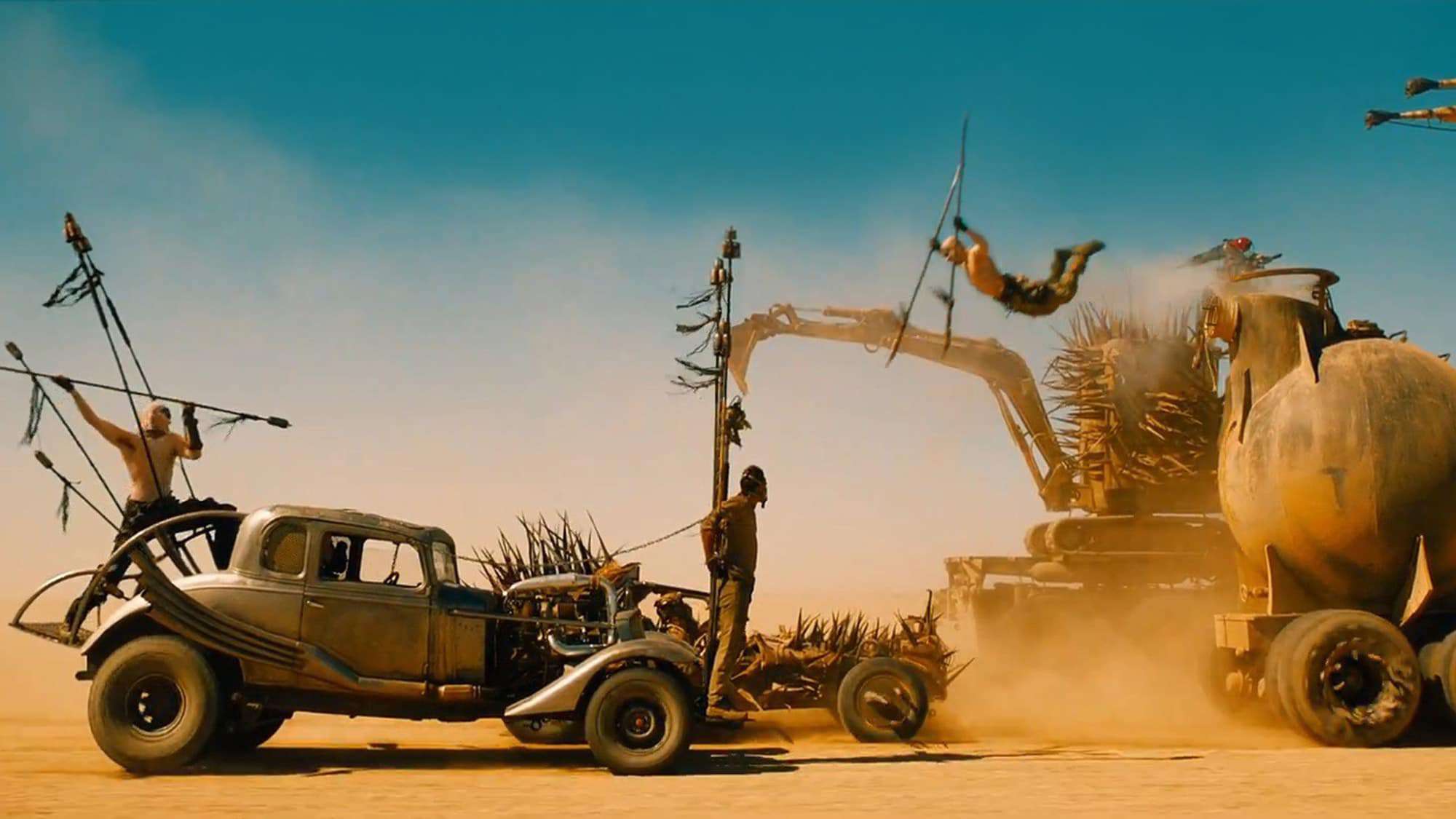
Rather than retread old ground, let’s look at something more innovative: co-writer/director George Miller’s Mad Max: Fury Road.
From the fleet of custom made vehicles to the 120-minute adrenaline rush of plot, there’s a lot to love about this film. One of the ways Miller made the action scenes so intense was by manipulating the frame rate. In certain key sequences, the camera is clearly under-cranked.
“Something like fifty or sixty percent of the film is not running at 24 frames a second,” said Jason Seale, the DP for the film. “It’ll be running below 24 frames because George Miller, if he couldn’t understand the shot, slowed it down until you could.”
Watch as the under-cranking really kicks in at 1:30:
You wouldn’t think the action in this sequence could get any more intense. After all, we’re in the middle of a post-apocalyptic car chase.
But under-cranking certain shots — and not hiding the effect, but instead emphasizing it — injects an otherworldly intensity. The jerking motion gives the action a lurid aspect, making the viewer feel as if you’re being pulled headlong into the action.
Shooting a dynamic hyperlapse
These days, everyone is all about hyper lapses, and you can create one by using the under-cranking method. Think of a hyperlapse as a moving timelapse, or more specifically, a timelapse in which the camera moves a significant distance.
To get that trademark movement in hyperlapses, most people are manually taking photos, stabilizing them in an editing software, and stringing them together. If you like to suffer for your work, this is always an option—but it’s worth considering this type of project from a different angle.
If you significantly under-crank the camera’s FPS, you’ll capture so few frames that any moving objects will inherently have that hyper-realistic motion blur. Of course, we’re talking much lower than 23 or 21 FPS — something more like 10 FPS.
And instead of hours of post-production work, you’ll only have a little touching up to do when it’s time to edit.
However, make sure you shoot with some sort of camera stabilizer to avoid that jerky handheld look. Undercranking makes the subjects’ movements in front of the camera more intense, but it also makes any movement by the camera more exaggerated.
For that reason, I recommend steering clear of shooting with a handheld and instead using a stabilizer (like a Ronin or Zhiyun) or a tripod.
Here’s a video with a few hyper lapses I did for Soundstripe at NAB in 2019:
A post shared by Soundstripe (@soundstripemusic) on
Since under-cranking isn’t widely utilized for hyperlapses, lots of filmmakers opt for photo-based technique. Essentially, you capture a series of individual images and edit them together to create the hyperlapse effect. On the positive side, since you’re taking megapixel photographs instead of 1080p or 4k video, the image resolution of a photo-based hyperlapse will be superb. All those images give you a lot of options for post manipulation. However, it’s a lot more work on the front-end and back-end. Under-cranking only takes a short time to set up, and it looks great right out of the can.
Adding dynamism to product videos
If you’ve ever filmed a product video, you know they can be challenging — particularly if you don’t have any actors in the shoot.
Sure, working with inanimate objects is less complicated than working with people, but objects are also less compelling. It’s down to you, the filmmaker, to create some interesting shots and make the entire affair engaging.
Under-cranking can be very handy here too. By filming some shots in a lower FPS, you can intersperse that footage with the stuff you filmed at normal speed to create some dazzling effects.
Here’s an example from a shoot I did at Soundstripe:
A post shared by Soundstripe (@soundstripemusic) on
As you can see, the camera movements are faster, and there’s a snap to them that you can’t get with a normal FPS. The under-cranking also brings a bit of inherent chaos, which adds some much needed drama to these shots.
These are only a couple of examples of how to use under-cranking. I’ve also used them in music videos to add a new dimension. This technique is great, because it doesn’t require a ton of heavy lifting in post production, and the style is unmistakable.
Given the focus on ultra slow-mo, under-cranking is a surefire way to make your next project stand out.
You might also enjoy this article about frame rates and shutterspeed.
This article was written by Chris Haggerty and Zach Watson. Chris is the resident filmmaker at Soundstripe, a royalty free music company. Zach is the content specialist.
Today is part 3 of our series on Color Grading 101. If you’ve been following it, you know that we’ve now covered two of the three ingredients essential to all filmmaking workflows: 1) human vision and 2) cameras.
Now that we understand the way these systems work and interact, we’re ready to take a look at the last of these three ingredients: displays.
Before we do so, let’s run through a quick recap of the imaging process as we’ve considered it thus far.
Quick Recap
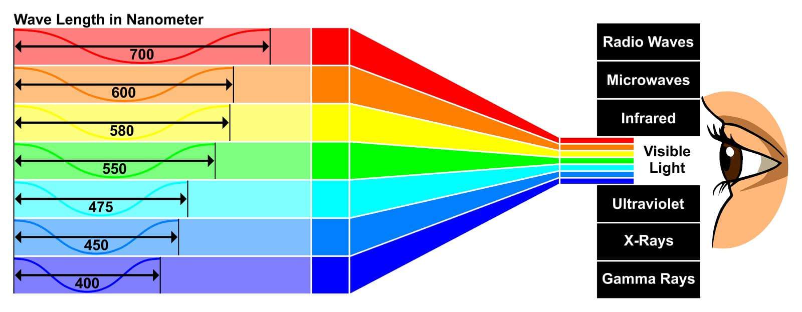
Our eyes experience a particular band of electromagnetic wavelengths as visible light
First, our eyes experience a finite range of the electromagnetic spectrum as visible light, from which we form an image. If we wish to capture that image, we use a camera — which, like our eyes, has its own sensitivities and limitations in terms of the electromagnetic radiation it can see and store. As we discussed in Part 2, the particulars of these sensitivities and limitations play a huge role in the character of the final viewable image, and navigating them mindfully is a critical step in successful image reproduction.
Today we’re discussing an equally critical step: understanding the sensitivities and limitations of our display, which we’re going to learn are often completely different from those of our camera. With this understanding in place, we’ll complete our survey of the basic building blocks of an imaging pipeline, establishing the ideal context for discussing the role of color grading within this larger process.
We’re going to start with an overview of the way all displays work — whether a projector, cell phone, or the old CRT TV you used to play video games on. From there, we’ll examine the key properties that define the capabilities and limitations of our displays. Let’s dive in
How a display works
To begin, let’s review the basic functionality of a display:
The display receives an encoded image as input — this signal can be digital or analog, and can be transmitted over a wide variety of connectors such as HDMI, SDI, component video, or composite video. In a good image pipeline, this signal has been prepared according to the measured capabilities of the display — more on this shortly.
The display converts the encoded image it receives into visible light, using one of a variety of technologies such as LCD, OLED, QLED, or projection. (We won’t go in depth today on these various technologies, except to touch on their performance in terms of the key properties we’ll be reviewing next.)
With this overall process in mind, let’s now examine the key properties that define our display’s performance.
Key properties of the display
In order to reproduce pleasing and lifelike images, we need to know the relationship between what our eyes can see and what our display can reproduce. We can determine this relationship by profiling the performance of the display in terms of the below properties — once each is accurately quantified, we prepare our image to give us the best possible match to how it would appear to our naked eye. In the context of this article, to prepare an image is simply to apply one or more mathematical transformations to it, based on the specifications of the display it’s being output to.
Resolution
This is the property you’re likely most familiar with, as it’s typically the first one that TV manufacturers boast over. While higher resolutions are generally preferable, there’s a point of diminishing returns around 2K, past which the other properties we’ll be looking at can exert an equal or greater influence over our experience of the image. For our purposes, the main point to stress regarding resolution is that we want our input signal’s resolution to match that of our display, which often involves scaling the source material up or down — for example, from 3840×2160 UHD to 1920×1080 HD.
Contrast ratio
Contrast ratio is perhaps the most fundamental characteristic of a display. As the name implies, it simply denotes the distance between the deepest shadows and the brightest highlights the display is capable of reproducing. This can range anywhere from 700:1 to 1,000,000:1 or higher. The greater the contrast ratio, the more dynamic and lifelike the image becomes. Some display technologies, such as LED and QLED, excel at reproducing bright highlights, but are less capable when it comes to shadow reproduction. Others, such as OLED, have excellent shadow reproduction, but fail to get as bright as their LED counterparts.
It’s also worth noting that since contrast ratio is determined by both of these factors, two displays with the same contrast ratio can still have markedly different performance in shadows or highlights.
Another term for contrast ratio is dynamic range, which you’ll remember from our prior installments on human vision and cameras. Both terms are simply a way of expressing the breadth of values from deepest shadows to brightest highlights. In the case of vision and cameras, we use it to describe the maximum range we can resolve or capture, and in the case of displays, the maximum range we can reproduce.
Contrast ratio is also one of the key factors in determining whether a display is classified as HDR (high dynamic range) or SDR (standard dynamic range) — the ratio for an HDR display will always be significantly higher than for an SDR display.
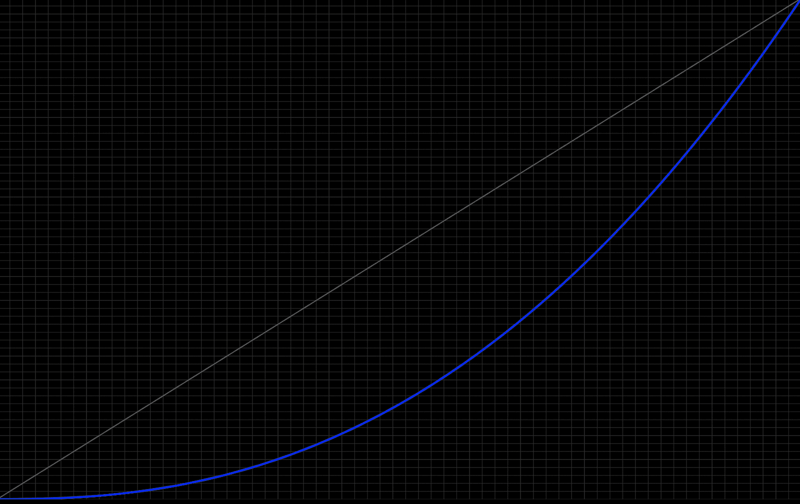
Tone curve
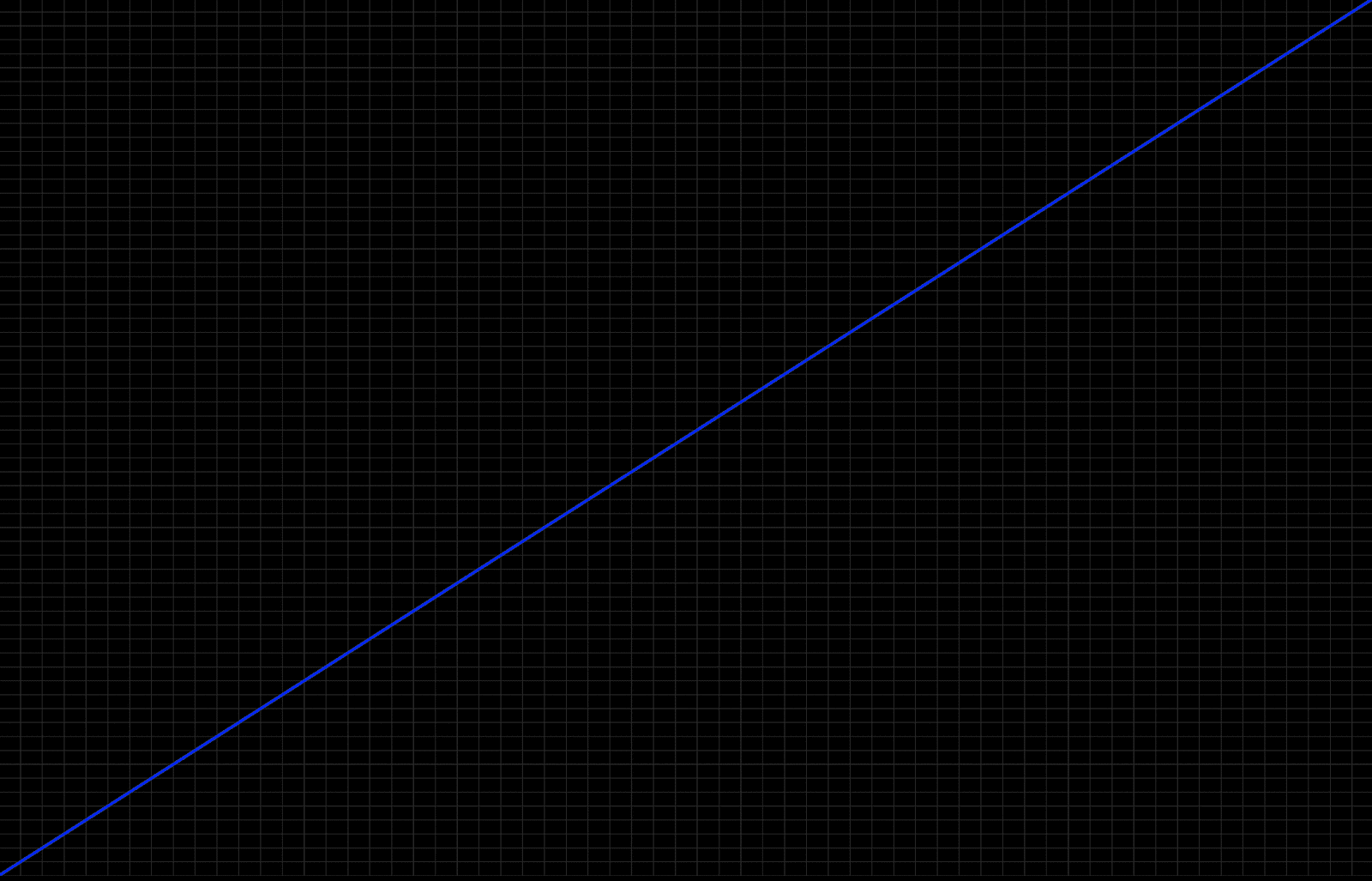
The tone curve of a display refers to the way the luminance values are distributed as our signal moves from deepest shadows to brightest highlights. For example, In a linear tone curve, a doubling of the signal would lead to a doubling of the light emitted by the display. This sounds straightforward, but it turns out that our eyes don’t perceive light in a linear fashion. Because of this, displays don’t either — they typically employ a gamma curve, which “bends” the entire signal downward, distributing the luminance values in a manner that feels perceptually linear.
A 2D plot depicting a linear tone curve
A 2D plot depicting a gamma tone curve
There are multiple flavors of gamma curve, including Gamma 2.4, Gamma 2.2, Gamma 2.1, and BT.1886. Knowing which of these curves our display expects and can faithfully reproduce is critical to properly preparingour signal for the display.
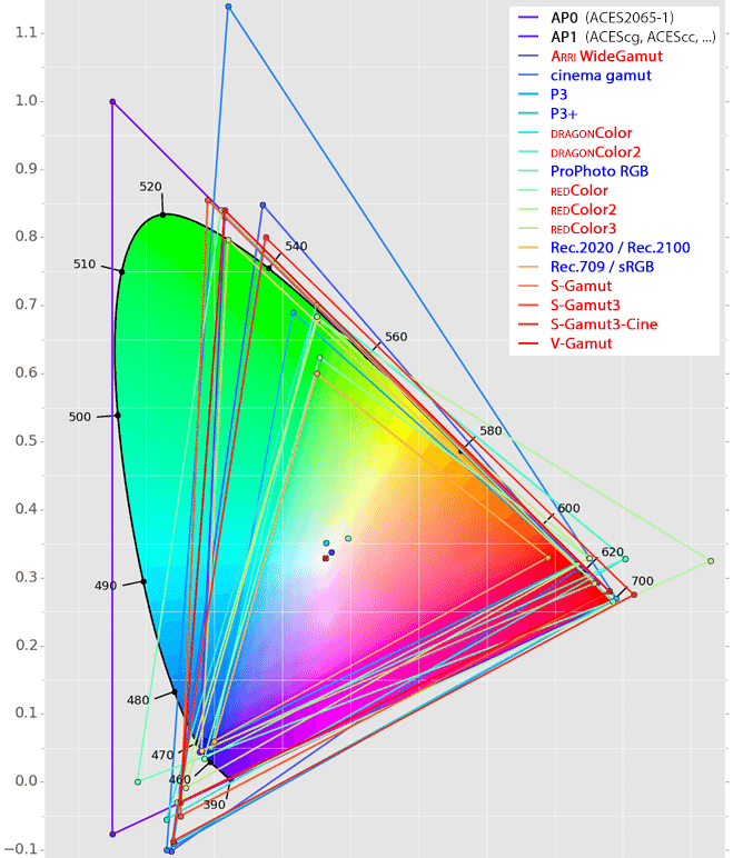
Color Gamut
This is another concept we’ve discussed in our prior installments. Color gamut refers to the portion of the visible spectrum a particular device is capable of capturing, storing, and/or reproducing. The larger this region, the more vibrant and lifelike the image will be. Common display gamuts include Rec 709, DCI-P3, and Rec 2020.
A CIE 1931 diagram depicting the visible spectrum (horseshoe shape) overlaid by the gamut boundaries of various camera and display color spaces
As with our tone curve, it’s imperative to know the color gamut our display expects and is capable of reproducing, in order to properly prepare our image for it.
Processing
When we discussed the basic functionality of a display, we actually glossed over a step between signal input and image output: processing. This can span a wide variety of adjustments to the signal, including scaling, noise reduction, contrast expansion, saturation increase, color temperature shift, and time-based adjustments such as frame rate smoothing. Some of these adjustments happen as static or fixed operations, while others are done dynamically in response to analysis of the incoming signal.
In virtually all cases, these various “enhancements” are designed to improve the perceptual performance of a display, but at the expense of accurately reproducing the filmmaker’s creative intent. If our goal is accurate reproduction, we want to disable as much of this processing as possible, leaving the properly prepared signal untouched as it moves from input to output. In fact, this is the exact agenda of the “filmmaker mode” TV setting being advocated by the UHD Alliance.
A word on HDR
HDR (high dynamic range) represents the most exciting development in display technology we’ve seen in many years. So why aren’t we talking more about it in this article?
In short, it’s because SDR (standard dynamic range) and HDR are arbitrary terms for displays capable (or incapable) of reaching specific performance benchmarks for the properties listed above. When we say a display is HDR, all we mean is that it has a higher contrast ratio and a larger color gamut than a traditional SDR display. The end result of these properties makes a huge difference to the way we experience images, but the terminology we use to delineate one from the other is fairly insignificant.
Closing
We’ve now reached the halfway point in our Color 101 series, and we’ve covered each of the three ingredients essential to all filmmaking workflows. With these concepts in place, we’re ready to begin studying the tools and techniques of color grading from a holistic perspective, allowing us to maximize our creativity, efficiency, and consistency. We’ll begin this process in Part 4, where we’ll examine the implications of one of the most overlooked decisions in color grading: scene-referred versus display-referred workflows. See you then!
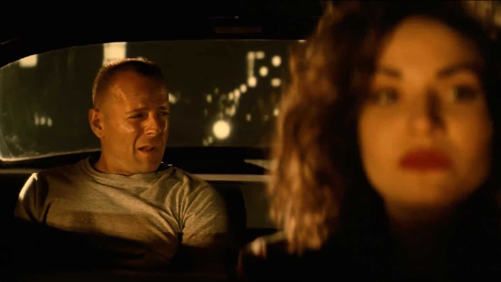
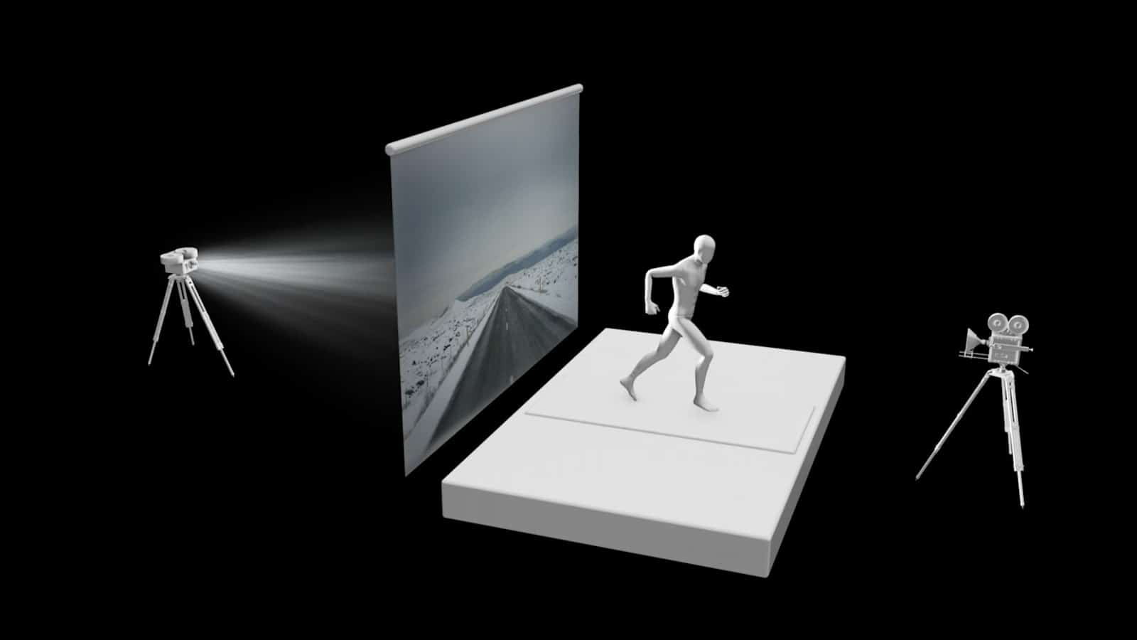
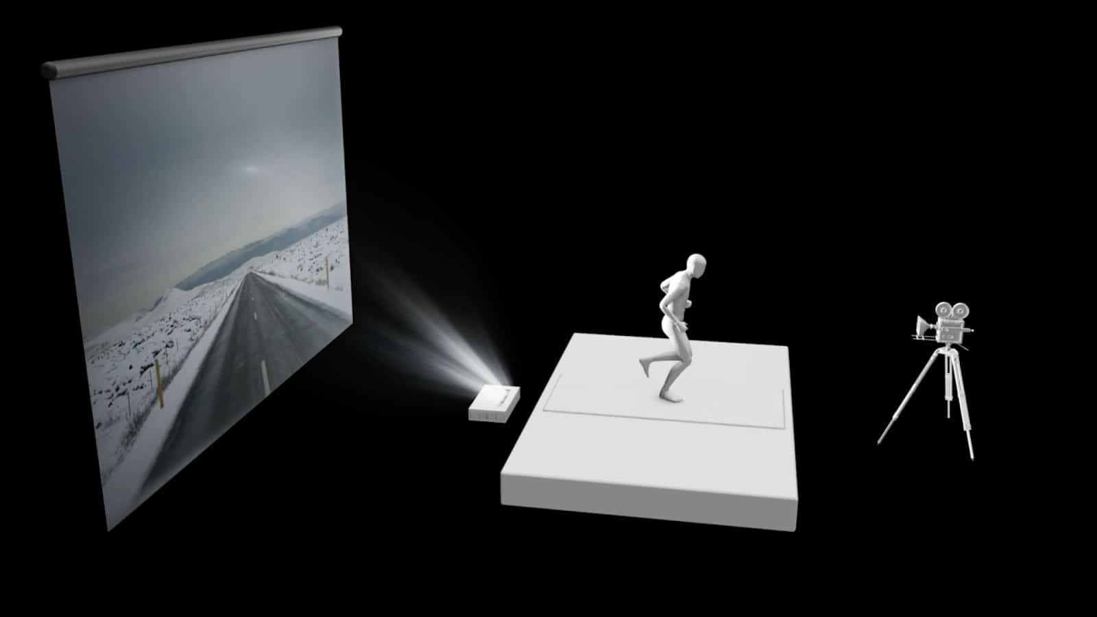
A couple of weeks ago I was watching Pulp Fiction (again) and I made a mental note about an aspect of that film I always found interesting. The scene where Bruce Willis’ character, Butch the Boxer, is in a cab and it’s obvious that the background of the city passing by is fake. I always thought it was green screen. But, as I learned from today’s episode of Film Riot, it was actually a projected image. In this case, a rear projected image of passing traffic (there’s another similar scene in the film with John Travolta’s Vincent Vega driving while high).
I’m used to seeing these kinds of scenes in older movies like the car chase scene in Dr. No.
I also remember starring in a “movie” myself when visiting Universal Studios Hollywood Tour and being the lucky kid chosen to help demonstrate this “groundbreaking” effect. (I think they used rear projection. Or was it a green screen example. I forget. It was a long time ago).
As Ryan points out in the episode, the history of the effect dates back to the early 20th century, with films like the 1930’s film Liliom and the 1920 film Just Imagine.
But you might be surprised at how many contemporary productions you’ve seen that used front or rear projection in lieu of green screen. Movies like Terminator 2, Oblivion, and Aliens, to modern TV shows like Disney+’s The Mandalorian.
You may ask yourself, “With the advancements like green screen and blue screen, why would anyone want to use front or rear projection?” There are a few practical benefits. First and foremost, there’s reduced post-production time. You don’t have to key out anything and then key in a new background. You also don’t have to deal with the pain of keying out hair.
Second, having a practical “effect” like front or rear projection on set, gives you more flexibility in lighting the subject and camera movement.
Ryan’s experiment with Emily and a beautiful, “blue hour” front projection.
This is all predicated on you having a high quality projector that can deliver imagery that looks as good as a green screen would. For this episode, Ryan was able to try out the LG Cinebeam. It boasts -4K resolution, a 2M:1 contrast ratio, DCI-P3 with 97% color accuracy, and HDR10 level brightness.
Pros and Cons of Front Projection vs Rear Projection
As the name suggests, rear projection is when a projector casts an image from behind a translucent screen. Front projection places a projector in front of a screen.
Rear projection
Front projection
The primary benefit of front projection vs. rear projection is that it allows for a more saturated and sharp image. The downside is the throw length. This is the length from the projector to the surface on which you’re projection. The light that is cast from the projector could bounce and hit the talent. One of the benefits of the LG Cinebeam is that is has 2” throw length that is able to cast a 90” image. You can bring it as far back as 7.2” for a 120” screen.
At the end of the day, front projection (or rear projection) still remain viable options for film productions looking to save post-production hassle; or if you want to communicate a particular style like the case of Tarantino. And to prove we put our money where I mouth this, this episode was shot using front projection for the usual Film Riot green screen background.
Ryan with Film Riot background
This episode’s set up with background projected from the front using the LG Cinebeam.
In Part 1 of this series, we covered the basics of human vision, gaining a better grasp of how our eyes work. This provides a great foundation for tackling today’s topic: camera basics and how they work.
But why should we care about this topic if our goal is to learn more about color grading? Can’t we trust manufacturers and cinematographers to worry about lenses, sensors, and the myriad technical details of a camera?
While it’s not necessary to become an authority on the subject, there are several excellent reasons for us to understand the mechanics of our cameras in greater depth:
It allows us to think and grade photographically: By understanding cameras and the process by which images are captured, we can step in as colorists to enhance and complement this process, speaking and operating in the photographic language of light, exposure, ratios, and color temperature, rather than imposing graphical language and tools.
It empowers us to separate hype from fact: With first-hand knowledge of the factors that go into capturing an image, we’re no longer forced to blindly accept the claims of camera manufacturers or other filmmakers. Instead, we can scientifically evaluate questions such as whether camera A truly has a superior resolution to that of camera B, or whether the latest sensor is really capable of capturing x stops of dynamic range. Armed with these critical tools, we can make the most of our images, and offer insight to our collaborators on the right tools for the job.
The camera is one of filmmaking’s three essential ingredients: Despite the endless variations and evolutions in filmmaking’s tools and processes, there are three key constants in any workflow: the human eye, the camera, and the display. By deepening our understanding of each of these core ingredients, we lay a foundation that allows us to make quality technical and creative choices, regardless of the particular project we’re working on.
Now that we have a clear purpose to our mission, let’s dive into a better understanding of the way cameras convert light into stored images. We’re going to start with an overview of the camera’s key components.
Key Parts of the Camera and Their Function
The Lens
85mm prime lens
The lens of our cameras serves the same function as the lens of our eyes: it admits and focuses incoming light. As with our eyes, the lens has a variable aperture which expands or contracts to admit more or less light — a counterpart to the iris found in our eyes.
Despite similar terms and functionality, the camera lens differs from that of the human eye in a few important ways:
A camera’s lens is often interchangeable, compared to the fixed lens of our eyes. Interchangeable lenses can differ from one another in terms of several objective factors, such as focal length, depth of field, and minimum/maximum aperture, as well as several subjective factors, such as contrast, sharpness, and bokeh (the way out-of-focus objects are rendered).
The lens’ aperture can be automatic or manual, while our eye’s aperture is always automatic, constantly adjusting to our environment without conscious manipulation.
The above point is also true of a lens’ focusing mechanism — this can be automatic or manual, compared to the fully automatic focus adjustments our eyes make as our attention shifts.
Sensor/Negative
Digital camera with lens removed to reveal its sensor
The sensor (or negative in the case of film capture) is analogous to the retina of the human eye: it is a light-sensitive surface which captures the focused image projected onto it by the lens. The underlying components of this surface can vary, but by definition it will always be some form of photosensitive device or material. Once captured, the image is either converted into an electronic signal, or, in the case of film capture, recorded directly on the negative before the camera’s motor advances to the next frame.
Processor/Encoder
This component and stage of the capture process varies in form depending on whether a digital or photochemical (film) capture system is being used.
In a digital capture system, the electronic signal produced by the sensor is next processed and encoded by the camera’s internal electronics. These steps can take a variety of forms, which can have a significant impact on the quality and character of the image. We’re going to discuss this in greater depth in the next section, but regardless of the specifics, the ultimate result is an image ready to be stored.
In a photochemical capture system, the sequencing and methods are a bit different, but the concepts are the same. The image is directly encoded to the raw negative, and later sent as an exposed roll to a laboratory, where it is chemically processed, resulting in a developed negative which, when printed to a positive film stock, produces a viewable image. As with digital systems, the amount and type of processing that takes place at the lab stage can vary considerably, and can have enormous impact on the quality and character of the image.
SSD/Magazine
SSD digital magazine (in red) slotted into a RED Epic-W camera
This is another component and stage of the process which differs between digital and photochemical capture.
In a digital system, the processed and encoded image is digitally stored onto a hard drive connected to the camera. This drive (or digital magazine) can be internal and fixed, or external and interchangeable, and can vary in terms of its capacity and write speed. As we’ll learn in the next section, these properties end up playing a key role in the amount and type of processing our image undergoes prior to being stored.
In a photochemical system, exposed film is re-spooled by the camera into its magazine until the roll is shot out, at which point it’s off-loaded in a light-proof changing tent into a canister sent to the laboratory for processing.
Key Properties of the Camera
Now that we’ve familiarized ourselves with the key parts of the camera, let’s discuss some of its key properties, and the impact they have on the image.
Sensor/plane size
The physical size of the sensor or film negative influences the captured image in a number of ways:
Sensitivity. All other factors being equal, the larger the plane, the higher the light sensitivity, due to the greater volume of photosensitive material.
Depth of field. All other factors being equal, as the plane size increases, the depth of field decreases, creating shallower focus.
Noise. All other factors being equal, the larger the plane, the lower the noise.
Sensor and plane size can vary tremendously, from the ultra-tiny sensor in a phone camera, to a large format such as 65mm film.
Color gamut
A CIE 1931 diagram depicting the visible spectrum (horseshoe shape) overlaid by the gamut boundaries of various camera and display color spaces
The color gamut of a camera is a way of measuring the full range of colors that it’s capable of capturing. This can range from smaller gamuts like sRGB (which might produce color clipping when capturing a traffic light, for example) to wide gamuts such as those found on Arri or RED cameras. Generally speaking, the larger the gamut, the more flexibility we have later — though as we’ll soon learn, larger gamuts come with additional responsibility as well.
This concept translates to photochemical capture as well, though the gamut tends to be less rigidly defined, and can vary not only between manufacturers and stocks, but between individual runs of the same stock, owing to the organic nature of the materials used.
Another way of thinking about a camera’s color gamut is in relation to the visible spectrum discussed in Part 1. Fundamentally, when we measure color gamut, we’re seeking to answer the question: How much of the visible spectrum is this device capable of accurately capturing?
Sensitivity
The sensitivity of a sensor or film negative refers to how much or little light is needed to create a healthy exposure. This is typically expressed in ISO for digital cameras, and ASA for film cameras, though the terms are interchangeable (meaning 800 ISO is equivalent to 800 ASA).
Dynamic range
The dynamic range (or latitude) of a camera expresses the maximum variation between light and shadow it can capture without clipping at either end, meaning an unrecoverable loss of detail. This is typically expressed in stops, and can range from 2-3 stops all the way to 20 or more. This concept corresponds to the dynamic range of our eyes as discussed in Part 1.
As with color gamut, we generally want to capture the largest dynamic range possible — provided we’re able to subsequently map and manage it, which we’ll return to later in this series.
Processing
The initial processing of an image plays a pivotal role in the process of motion imaging, whether in-camera (for digital sensors), or at a laboratory (for photochemical capture). On the digital side, camera manufacturers seek to perform processing which strikes a balance between reining in bandwidth and storage needs while preserving as much image quality as possible. This balance looks very different between consumer and professional devices. In consumer devices, the priority skews toward low cost, even if it comes at the expense of storing a larger, higher-quality image. In professional devices, the priority is on keeping processing to a minimum to afford maximum flexibility in post, but this creates the demand for more robust bandwidth and storage.
Accuracy
The accuracy or calibration of a camera refers to how faithfully it captures color. As a simple example, a camera in need of calibration might capture everything with a prominent magenta bias, skewing images away from the true wavelengths reflected at the time of capture. This factor is just as important as a large color gamut or broad dynamic range, because it may or may not be possible to fully and accurately compensate for poor calibration once images are captured.
Frame rate and shutter speed
Thus far in our series, we’ve mostly skirted around the “motion” aspect of motion imaging. Cameras capture still images in tight succession which are later reproduced, and the illusion of motion is provided by our visual system, owing to a phenomenon called persistence of vision. The rate at which these successive images are captured, and the length of interval in between, are known respectively as frame rate and shutter speed.
Frame rate and shutter speed, while related, do not have a fixed relationship to one another, and can both vary widely within and across different cameras, producing an equally wide range of subjective effects. For nearly a century, the gold standard for these attributes has been a 24 frame per second frame rate, and a 1/48 second shutter speed, but exceptions abound. Lower frame rate capture (in combination with 24fps playback) is used for timelapse photography, and higher frame rate capture is used for slow-motion, to list a few simple examples.
The maximum frame rate that a camera can record at is dependent on a number of the previously-listed factors, including sensitivity, processing power, and storage speed.
Closing
We’ve now covered the basics of both human vision and cameras, which comprise two of the three key ingredients in any filmmaking workflow. We’re now ready to talk about the third ingredient: displays, which will be the focus of our next installment in this series.
Once we’ve covered each of these three ingredients, we’ll be in an ideal position to understand the role color grading plays within the filmmaking process, and to discuss it in a holistic context.