Today is part 3 of our series on Color Grading 101. If you’ve been following it, you know that we’ve now covered two of the three ingredients essential to all filmmaking workflows: 1) human vision and 2) cameras.
Now that we understand the way these systems work and interact, we’re ready to take a look at the last of these three ingredients: displays.
Before we do so, let’s run through a quick recap of the imaging process as we’ve considered it thus far.
Quick Recap
First, our eyes experience a finite range of the electromagnetic spectrum as visible light, from which we form an image. If we wish to capture that image, we use a camera — which, like our eyes, has its own sensitivities and limitations in terms of the electromagnetic radiation it can see and store. As we discussed in Part 2, the particulars of these sensitivities and limitations play a huge role in the character of the final viewable image, and navigating them mindfully is a critical step in successful image reproduction.
Today we’re discussing an equally critical step: understanding the sensitivities and limitations of our display, which we’re going to learn are often completely different from those of our camera. With this understanding in place, we’ll complete our survey of the basic building blocks of an imaging pipeline, establishing the ideal context for discussing the role of color grading within this larger process.
We’re going to start with an overview of the way all displays work — whether a projector, cell phone, or the old CRT TV you used to play video games on. From there, we’ll examine the key properties that define the capabilities and limitations of our displays. Let’s dive in
How a display works
To begin, let’s review the basic functionality of a display:
- The display receives an encoded image as input — this signal can be digital or analog, and can be transmitted over a wide variety of connectors such as HDMI, SDI, component video, or composite video. In a good image pipeline, this signal has been prepared according to the measured capabilities of the display — more on this shortly.
- The display converts the encoded image it receives into visible light, using one of a variety of technologies such as LCD, OLED, QLED, or projection. (We won’t go in depth today on these various technologies, except to touch on their performance in terms of the key properties we’ll be reviewing next.)
With this overall process in mind, let’s now examine the key properties that define our display’s performance.
Key properties of the display
In order to reproduce pleasing and lifelike images, we need to know the relationship between what our eyes can see and what our display can reproduce. We can determine this relationship by profiling the performance of the display in terms of the below properties — once each is accurately quantified, we prepare our image to give us the best possible match to how it would appear to our naked eye. In the context of this article, to prepare an image is simply to apply one or more mathematical transformations to it, based on the specifications of the display it’s being output to.
Resolution
This is the property you’re likely most familiar with, as it’s typically the first one that TV manufacturers boast over. While higher resolutions are generally preferable, there’s a point of diminishing returns around 2K, past which the other properties we’ll be looking at can exert an equal or greater influence over our experience of the image. For our purposes, the main point to stress regarding resolution is that we want our input signal’s resolution to match that of our display, which often involves scaling the source material up or down — for example, from 3840×2160 UHD to 1920×1080 HD.
Contrast ratio
Contrast ratio is perhaps the most fundamental characteristic of a display. As the name implies, it simply denotes the distance between the deepest shadows and the brightest highlights the display is capable of reproducing. This can range anywhere from 700:1 to 1,000,000:1 or higher. The greater the contrast ratio, the more dynamic and lifelike the image becomes. Some display technologies, such as LED and QLED, excel at reproducing bright highlights, but are less capable when it comes to shadow reproduction. Others, such as OLED, have excellent shadow reproduction, but fail to get as bright as their LED counterparts.
It’s also worth noting that since contrast ratio is determined by both of these factors, two displays with the same contrast ratio can still have markedly different performance in shadows or highlights.
Another term for contrast ratio is dynamic range, which you’ll remember from our prior installments on human vision and cameras. Both terms are simply a way of expressing the breadth of values from deepest shadows to brightest highlights. In the case of vision and cameras, we use it to describe the maximum range we can resolve or capture, and in the case of displays, the maximum range we can reproduce.
Contrast ratio is also one of the key factors in determining whether a display is classified as HDR (high dynamic range) or SDR (standard dynamic range) — the ratio for an HDR display will always be significantly higher than for an SDR display.
Tone curve
The tone curve of a display refers to the way the luminance values are distributed as our signal moves from deepest shadows to brightest highlights. For example, In a linear tone curve, a doubling of the signal would lead to a doubling of the light emitted by the display. This sounds straightforward, but it turns out that our eyes don’t perceive light in a linear fashion. Because of this, displays don’t either — they typically employ a gamma curve, which “bends” the entire signal downward, distributing the luminance values in a manner that feels perceptually linear.
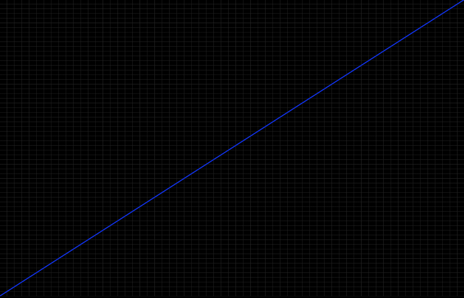
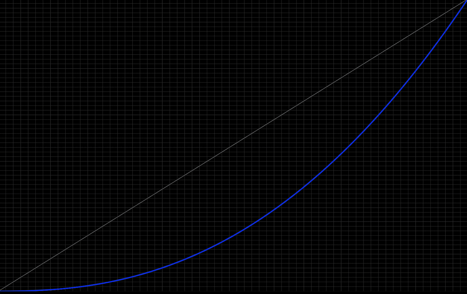
There are multiple flavors of gamma curve, including Gamma 2.4, Gamma 2.2, Gamma 2.1, and BT.1886. Knowing which of these curves our display expects and can faithfully reproduce is critical to properly preparing our signal for the display.
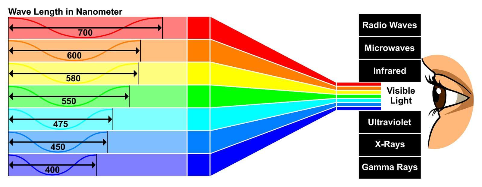
Color Gamut
This is another concept we’ve discussed in our prior installments. Color gamut refers to the portion of the visible spectrum a particular device is capable of capturing, storing, and/or reproducing. The larger this region, the more vibrant and lifelike the image will be. Common display gamuts include Rec 709, DCI-P3, and Rec 2020.
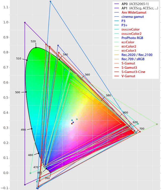
As with our tone curve, it’s imperative to know the color gamut our display expects and is capable of reproducing, in order to properly prepare our image for it.
Processing
When we discussed the basic functionality of a display, we actually glossed over a step between signal input and image output: processing. This can span a wide variety of adjustments to the signal, including scaling, noise reduction, contrast expansion, saturation increase, color temperature shift, and time-based adjustments such as frame rate smoothing. Some of these adjustments happen as static or fixed operations, while others are done dynamically in response to analysis of the incoming signal.
In virtually all cases, these various “enhancements” are designed to improve the perceptual performance of a display, but at the expense of accurately reproducing the filmmaker’s creative intent. If our goal is accurate reproduction, we want to disable as much of this processing as possible, leaving the properly prepared signal untouched as it moves from input to output. In fact, this is the exact agenda of the “filmmaker mode” TV setting being advocated by the UHD Alliance.
A word on HDR
HDR (high dynamic range) represents the most exciting development in display technology we’ve seen in many years. So why aren’t we talking more about it in this article?
In short, it’s because SDR (standard dynamic range) and HDR are arbitrary terms for displays capable (or incapable) of reaching specific performance benchmarks for the properties listed above. When we say a display is HDR, all we mean is that it has a higher contrast ratio and a larger color gamut than a traditional SDR display. The end result of these properties makes a huge difference to the way we experience images, but the terminology we use to delineate one from the other is fairly insignificant.
Closing
We’ve now reached the halfway point in our Color 101 series, and we’ve covered each of the three ingredients essential to all filmmaking workflows. With these concepts in place, we’re ready to begin studying the tools and techniques of color grading from a holistic perspective, allowing us to maximize our creativity, efficiency, and consistency. We’ll begin this process in Part 4, where we’ll examine the implications of one of the most overlooked decisions in color grading: scene-referred versus display-referred workflows. See you then!
Feature image by Kelvin Design UK on Unsplash